Effective Email Marketing For Online Course Creators
 Platform Review
Learn how to promote your online courses through email in an ethical but still very effective way, without sounding salesy at all.
In this post, I'm going to share with you my personal strategy for promoting my online courses via email marketing, using an email list, and show you some of the results.
I've been doing this for years and it works perfectly!
I don't see this strategy mentioned that often in online course creator forums if at all, as almost everyone is going for the same old angles of "do you have a template for an email funnel that I can reuse", etc.
If you are a course creator too, I don't think that taking the general email advice that you see mentioned around will work, as everyone is using the exact same tactics, which were learned from the exact same sources.
Instead, what you need is email marketing advice that is super-specific to you, as an online course creator.
How can you promote your online courses in an ethical way, without being salesy or coming across the wrong way? There is a very simple way to do it, and you will learn how to use email marketing for course creators in this post.
The Current State of Email Marketing
I'm sure that you see it a lot in your own mailbox, both on your main inbox and worst inside the dreaded Promotions folder: everyone is sending you a canned email sequence where they are telling you some sort of story that might or might not be interesting, or trying to sell you something, more or less directly.
But you can very easily see through all of those very basic tactics, and you just trash those emails one after the other.
So how can you as an online course creator do it differently, and set yourself apart from the other mails that you are competing against in your student's busy mailboxes?
The only way to set yourself apart is to do something different than everyone else. You need to write your emails in a very intentional and strategic way.
Let's then start with what not to do.
How to Not Write Emails for Promoting an Online Course
Most course creators know that they shouldn't write emails to try to sell something directly, that is a bad idea for sure.
But what a lot of creators still do, is to send emails that have no real intrinsic value.
When you open their emails and you read them, you find that the email is often just a pitch to convince you to try to click on a link to either read a blog post or watch a video.
But most of the time, you aren't willing to interrupt your email browsing session to go watch that video or read that post. So you just trash the email, and when the next email comes around, what do you do?
That's right, you trash it directly and don't even open it. After all, you already know that it's not worth reading, it's just another pitch to click on some link and just another waste of your time.
Another type of emails that you get, are telling you some sort of relevant or maybe even not so relevant story, in the hope of establishing some sort of emotional connection with you.
But most of the time, and unless it's extremely well done, you can see right through it, don't you? Why would anyone bother to send you that story? Most likely, they want something from you.
You want to avoid this completely, and instead, you want to write your emails in a completely different way (I'll give a complete example).
How to Write Effective Emails as an Online Course Creator
If you are an online course creator, you are a teacher as well, right? Students have subscribed to your email list in order to learn something from you: Excel, Web Development, Gardening, Cooking, etc.
So in your emails, don't position yourself as a salesman or a content creator trying to get clicks to some video or blog post.
Instead, position yourself as a teacher from the start, and simply teach them as much as you can, directly there on the email!
Sure, the email can (and should) have a link to some blog post or video that you want your students to see, but that is secondary and not the main point of the email.
The email itself should be helpful and useful to the student, so you should take the time to write a couple of paragraphs that simply teach your students something that they want to learn, right there in the email text!
You can take a complex concept and summarize it into a few well-thought-out paragraphs, or you can provide a shortlist of items that illustrate a point about something that they want to learn, but whatever it is, it should be concise, and it should be useful to the student by itself.
If the student wants to learn more, they can always click on the link that you sent them, but that is not the main point of the email.
What should be the main goal of your emails?
The main goal of the email is not to promote some link, the main point of the email is for the student to actually read it and learn something from the email text itself.
This way, even if they close the email without clicking on anything, at least they opened the email, read it, and learned something useful from you, and they are now starting to see you as a teacher who can help them learn what they want to learn.
That little "light bulb" moment that they had when they read your email and they finally understood something that they were trying to grasp for so long, or that moment when they were introduced to a brand new concept, that moment is going to be associated to you and it will make them want to open your next email, because they know that it will be an email worth reading.
Nothing will convince a student more that you are the right teacher that they have been looking for, than to simply teach them something right there on the email, without the need for any other support material.
So how do you write such an email?
How to Write an Email as a Course Creator
Let's take this step-by-step, starting with the subject line. General email marketing advice tells you that your open rate is determined by the subject line alone.
But if you think about it, this is simply not true. Sure, the open rate of your first email is going to be determined first by the relevance of the email from the point of view of your audience, and second by the subject line.
In your first email, you will get a pass and most people will give you a chance to see how you can help them.
But the performance of your second email is going to be determined mostly by the experience that you provided in your first email 😉, more than anything else.
Most people have a quite good memory. If you either cross them in some way or if you help them out, they will remember you 30 years from now. So when your second email gets to their inbox, you can be pretty sure that they will remember your first email.
And the experience that you gave them in your first email is going to influence a lot their decision to even open your second email, independently of the subject line!
Did they learn something from you, was the previous email worth reading? Did it have something interesting in it, some small nugget of information, or was it just a pitch to click on a link?
That is what is going to influence more than anything their decision to keep opening your emails.
But sure, the email subject is important and it will also influence a lot the decision to open the email. To give you some examples, here are some subject lines of my welcome sequence, and the corresponding stats:
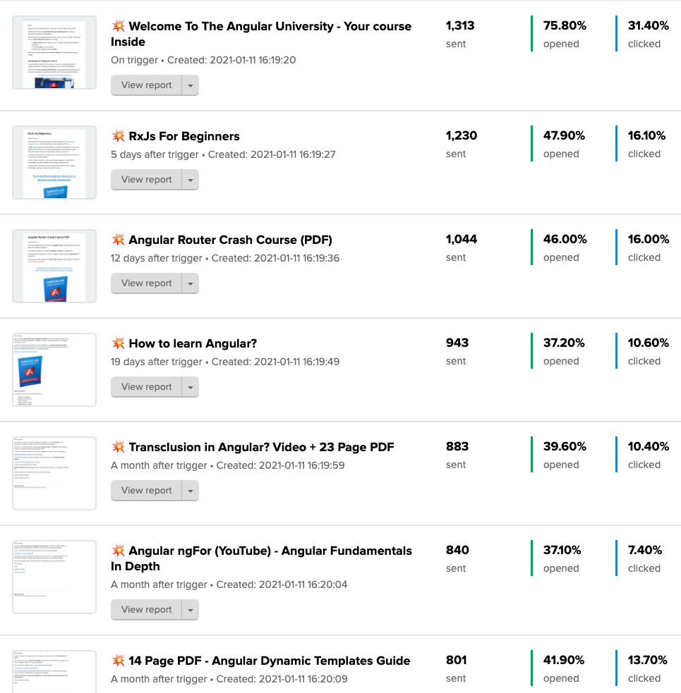
If you check the stats, these emails do very well, compared to the industry average.
Look at the first email of the sequence, 75% open rate, 30% click-through rate, those seem like 1999 Gary Vaynerchuk numbers 😊.
So let's learn how to write an email like this, step by step.
How to Write an Effective Subject Line For an Educational Email
So let's start at the beginning, with the email subject line.
As you can see, I like to add a collision emoji 💥 to the subject line, I feel that it makes the email stand out on a mailbox a bit more, and gives it that extra chance of getting opened.
Please don't worry about the possibility of this giving a sign to the Email provider that is a commercial email, that should be sent to the Promotions folder.
There is no way that you can or even should try to trick the email server to think that this is not a somewhat commercial email.
The artificial intelligence algorithm that decides in which folder to place the email will know if your email has a commercial intent behind it, independently of anything that you do.
Remember, the email will be placed in the main Inbox if the email provider algorithm believes that the student actually wants to read it, independently if the email is commercial or not, and this is determined mostly by the user interactions with your previous emails.
Did they read the previous email, did they trash them without reading them, did they open it and trash it immediately? All this data is collected by the email provider, and used to determine where your next email should end up.
So don't worry about adding an emoji to the beginning of the subject line, this is in my experience works quite well and not a lot of people do it yet.
Besides that, notice that most of the subject lines are Written In Title Case (by capitalizing every word), making them just a little bit easier to read in a crowded mailbox, and grabbing just a little bit more attention.
Again, we are optimizing for the human angle, not the algorithm. If it makes it easier to grab the attention of the human eye, we will go for it.
Notice also that many of the email subject lines are in the form of a question. I found over the years that some of my best-performing emails use a question as their subject line.
When a student reads the subject line of an email, they are trying to determine if the email is worth opening and reading.
The question mark is implicitly making a promise saying that the content of the email will provide an answer to the question, and if the question is interesting for the student, they will at least open the email.
How to Make Sure That Your Educational Emails Are Read
Notice that just because an email gets opened, that does not mean that your students will read it.
If you don't believe this, then think about your own behavior when going through you inbox. How many times do you open an email just to trash it instantly?
Many times you will open the email with the decision already taken of trashing it immediately, and you do it just because that is the quickest way of getting rid of the email.
But that insta-trash email will get counted as read in your stats! So how can you know if your emails are getting read or not? Well, you actually can't know for sure, there is no way to do that with current email technology.
So the only thing that you can do, is to make sure that your email is as readable as possible, again from a human angle.
This means that your email should be clearly formatted, with a well visible font with lots of contrast to the background. You should avoid large blobs of text, that will result in an immediate deletion.
Use bullet points and lists wherever applicable, in order to make the email more readable, and apply bold and italic where meaningful in order to highlight an important point.
In order to better illustrate all the best practices to consider while writing an educational email, let's take a complete example and break it down step-by-step.
Step-by-step Breakdown of an Effective Educational Email
I'm going to break down an email that I sent recently to my email list, that applies all these principles. You can find the full email here.
The subject line of this sample email is: "💥 What Are Firestore Security Rules?". Nevermind what Firestore is, it's a server product from Google.
Instead, notice the simple subject line, written in Title Case, under the form of a specific question.
Although the subject of the email is technical, I think it helps a lot to see a concrete example. Let's start by breaking down the first part of the email:
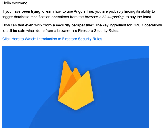
Here are some of the elements that we notice in this initial section of the email:
- the formatting is very simple, it's just a plain rich-text email, without any advanced HTML formatting.
- The background of the email is white, and the font is very readable and dark, creating very crisp contrast and making the email very easy to read
- The text is nicely formatted and uses bold and italic to emphasize certain points, and the sentences are short, two to 3 lines at most
- There is no wall of text to read, the student can easily skim through the email and parse it visually, thanks to the formatting.
- After two paragraphs or so, while talking about the subject and highlighting a question that the student likely has, I present a link to a free video, hosted on my website
- This video that I'm linking to is a free video lesson that is part of my ongoing course, so I did not create this video explicitly for this email. From the video page, there is a direct link to the course landing page
- Notice that the video page that I'm pointing to is not hosted on OnlineCourseHost.com, our platform looks a lot better than that
- The link anchor text starts with "Click Here to Watch", giving the student an indication of what they will be able to do after clicking on the link, so they know what to expect
- The content of the video is of course directly related to the question in the email subject
- The video is watchable without the student having to login to the course website, so they can hit play and just watch the video right there if they want
- The email contains one single image, which is the thumbnail of the course that I'm currently recording, which is in pre-launch mode
- This makes the student familiar with the course logo of an upcoming course, so when the course launches they already know the logo
- The image is clickable and is also linked to the same video
So this is the first part of the email, that most readers will read, giving you a chance as a course creator to have them know what you are teaching them, and proposing them to click on a link early on in the email.
But then, as many students won't click on a link, there is also some extra information right there on the email, under the form of a summary.
Let's then have a look at the second part of the email:
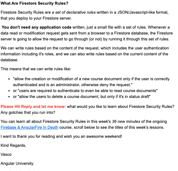
This particular example is a bit longer than what I usually write, but sometimes you do need that extra paragraph to explain something better, and that's OK.
Notice how I start the second part of the email: I'm repeating the question on the email subject as a section title.
If the student opened the email looking directly for the answer to the question on in the email subject, they will be skimming through the email looking for the answer.
Repeating the question on the heading of the second part of the email will guide their eyes to the answer, and help ensure that the email will actually get read.
In the second part of the email, I give a direct answer to the question asked in the email subject. This is a summary, that gives the student a general idea of the answer, and introduces a new concept.
I know the email content is technical in this case, but look at the formatting, it uses bullet points if applicable, as well as bold and italic.
The text is very easy to read, and it's not that much text. If it's a huge wall of text, people will decide very quickly to just trash the email.
But if they are interested in the subject, and they see that it's only a few paragraphs, they will take the time to read it.
After the answer, notice also the following elements:
- I say "Please Hit Reply and let me know", and I highlight this in red, this is the only red text in the email and it really stands out.
- I get a lot of invaluable replies with tons of interesting feedback thanks to this
- Getting replies also makes it easier for my next email to land on their mailbox, because it gives an indication to email providers that the student is interested in the content
- The increased email deliverability to a handful of people is a nice bonus, but it's not the main reason why I do it, the feedback that I get is way more important
- Most people won't reply, but some will and you should read every single reply and try to reply to them if necessary, to learn more about their difficulties
- After the call to reply, there is a line saying that this video is part of a certain course, and there is a very visible blue link to the course landing page.
- This is effectively a product mention, sent with every email, but it does not come across as salesy at all I believe. The student now knows about the existence of this course, and can go and check it out.
- The email concludes with a farewell message, where you should add your name and brand name so that the student knows where the email comes from.
- The email will also have at the bottom an unsubscribe link as usual
The Main Elements of an Effective Educational Email
Let's then quickly summarize the main elements of an educational email, that I think you should aim to send out more or less once a week:
- The main goal of the email should always be to teach something, right there on the email body, while providing additional material if the student wants to learn more, under the form of a link
- The email should be optimized for readability. It should be well formatted, have good fonts and good contrast and it should be very easy to read, no large blogs of text should be used.
- The email can ask the student a question in the subject and answer it directly in the message body
- The email should also have a link to a free video in one of your courses, and link directly to your website. In my view, using your email to send students to social media (including YouTube) is a wasted opportunity to have them get to know you better, as well as your website
- The email is lightly branded, it contains the thumbnail of one of your courses, and it mentions your brand name in the signature, but other than that it's a very simple rich-text email
When to Send Non-Educational Sales Emails?
I personally only send non-educational emails from time to time, promoting directly a service such as for example a subscription.
My suggestion is to do this strategically only a couple of times a year, around Black Friday, New Year and another third yearly event, like a company anniversary for example.
But this is the subject for a whole other blog post, that I think I will write on how to create an ethical sales funnel for promoting online courses. Let me know in the comments below if you would be interested in reading that post!
To get notified when I release new content here in the Academy, you can subscribe here to my weekly newsletter:
Conclusions: Email Marketing for Online Courses
And this, in a nutshell is how you create a highly effective educational email. As you can see, it's quite simple but still there is a lot to it.
Remember that what drives a student to open and read one of your emails, is the experience that you gave them in your previous email.
Students will remember if they learned from you or not, and they will learn to trust you over time as a reliable teacher that continuously helps them get up to speed with a given topic over time.
Even though you are mentioning your products (the video course) in every email, and linking to your course (under the form of a free lesson) also in almost every email, this does not come across as salesy at all.
From the point of view of the student receiving your emails, you are helping them out to learn your topic and you are sending them free useful learning material.
Your emails are always worth reading from their point of view, because they are well written, easy to read and jam-packed with useful information.
So that is why I think this way of emailing your students is an ethical way to do it. With this type of emails, you are simply teaching them something that they have subscribed to learn from you in the first place.
I hope this helped, if you have any questions about any of this, post them in the comment section below and I'll get back to you, you can also post them in our Course Creator Facebook Group if you prefer.
And if you are looking for a platform to host your online courses, create an account at OnlineCourseHost.com and start creating your courses using our Free Plan.
Also, you can find all my in-depth guides with everything that you need to know about course creation on the Course Creator Academy Home Page.
Check out also any other posts that you might be interested in the blog home page.
That's all I got for today, see you soon and meanwhile I wish you Happy Teaching!
Vasco Cavalheiro
OnlineCourseHost.com Founder & Online Course Creator
LinkedIn Facebook Page Facebook Group Twitter
You are welcome to ask me any questions in the comments below: 👇👇👇👇


 Start Here
 Course Creation Journey Step by Step
  Course Creation Software Reviews
 Online Course Marketing
 Course Creation Tips & Tricks
 Course Equipment
 Online Course Marketplaces
 Revenue Reports
 Best Practices
 Frequently Asked Questions
 Platform Reviews