


How to Create an Online Course Thumbnail (to Boost Conversions)
 Platform Review

Everything that you need to know in order to create a high-converting online course thumbnail image, to help to better brand and sell your online courses.
If you are selling an online course or are planning to do so, it's important to be aware of this one simple fact.
No matter how much work you put into the course creation process:
Your students will most of the time decide if they buy your course or not based on the course title and thumbnail , and little else!
If you doubt this, notice your own online purchasing behaviors the next time that you are doing some online shopping. The next time that you are shopping on Amazon, notice how much of your buying decision is based simply on the image of the product, the title, the price, and very little else of anything.
This means that in terms of course sales, it's absolutely essential to get the thumbnail of your course right from the start. You just have to understand how to create a course thumbnail!
So, how do you create an online course thumbnail?
Follow these steps to create a professional-looking online course thumbnail for your online course:
- Check the size specifications for a thumbnail in your target platform
- Choose a graphic designer on a freelance website like Fiverr.com
- Or sign-up for a free and easy-to-use design tool like Canva
- write the specifications for your thumbnail
- lookout for crop areas
- choose relevant images
- use text carefully
- consider using stock photography
- order the thumbnail and ask for revisions until satisfied
The other equally important element in your course sales page is your course title. Check out this separate guide to learn how to optimize your title: How To Write a Killer Online Course Title.
And if you are looking to learn in general about all other aspects of your course sales page besides the thumbnail itself, have a look at How To Create The Perfect Online Course Sales Page.
If you are on a budget and prefer to create the thumbnail yourself, check out this guide How To Create an Online Course Thumbnail with Canva (For Free).
Table of contents
If you are looking to learn more about online teaching, you can find all our guides on the Academy home page, with the recommended reading order.
The previous article in this series is: How to find the best online course topics.
So without further ado, let's get started learning everything that you need to know in order to create your very first online course from scratch.
What is a course image thumbnail?
A thumbnail is a branded image that will allow you to make your course easily recognizable to your students. Here is an example of what an online course thumbnail could look like:

Why create the course thumbnail first?
We believe that it would be a huge mistake and a wasted opportunity to leave the course image creation to the end of the course creation process.
Actually, starting with creating a course thumbnail is a very powerful way to kick-start the whole creative process!
As course creators, it's very inspiring to have this first image that makes it easy to imagine the course as already completed.
Besides the inspiration and motivation factor which is huge, there are also other good practical reasons. Having the course thumbnail will allow you to start promoting your course early, while it's still in the early draft and recording phases.
You can send the image to your audience via your email list or share it on social media, and start creating some anticipation for the course even weeks and months before it's ready.
If you email your audience every week a free sample video lesson that you have recorded, or even some informational text teaching something interesting around the course topic and you include also in the email your course thumbnail, this will create further interest and anticipation that will help a lot when the course launches.
With the course thumbnail and an early course description, you can even pre-sell a course even before recording it!
Simply take the thumbnail, and the description, set a price for your course, and start selling it already. We do this all the time with great results, but we don't advise doing this for your first course though.
Once you have gone through the whole process at least once, then pre-selling becomes a great option and the thumbnail is necessary for that.
Using the course thumbnail for consistent course branding
Getting the course thumbnail early will also allow us to easily brand your videos from the beginning.
Any material that you use on the videos for example PowerPoint slides, graphics, or other learning material can be easily branded using the thumbnail.
This will make the course look a lot more professional and consistent, and all that it takes for that is just one course image, created at the very beginning of the course creation process.
How to create an online course thumbnail?
The best way to create a course thumbnail is to hire a professional designer. A great design by a seasoned professional will cost you only around $10 or less, to $20, and it makes for a huge difference in terms of course sales.
So what are the specifications for a great image, what errors to avoid, how to best explain all your requirements to your designer, and how to choose the best designer?
All of these things are important, otherwise, you will end up with a thumbnail that is not at all what you wanted. So let's go over them one by one.
Why not try to do the thumbnail ourselves?
If we use a cheap design for your course thumbnail that looks like it was put together by a 5-year-old, that is going to make it a lot harder than it should be for someone to decide to enter their credit card on your website.
One of the main things that people notice when they reach a new website is the quality of the design. This helps them to determine if the site is trustworthy or not, and this is especially true for commercial products.
There are free tools out there for doing thumbnails, for example, the canva.com YouTube thumbnail generator, but we don't recommend that you try to create your own thumbnail with these tools unless you are an experienced graphics designer.
Instead, we recommend that you order your thumbnail online from a freelance designer, there are multiple websites where you can do that at a very affordable price and get exactly the thumbnail that you need, so it's a no-brainer.
Where to order an online course thumbnail?
If you don't have experience hiring freelancers online, we recommend that you simply use the platform fiverr.com, and order your first thumbnail from there.
This is a freelancing platform for fixed-cost one-time projects, where you find all sorts of creative professionals like designers, web developers, video editors, etc.
How to order a course thumbnail on Fiverr?
If you simply search for the term "thumbnail", this will give you all sorts of results to choose from:
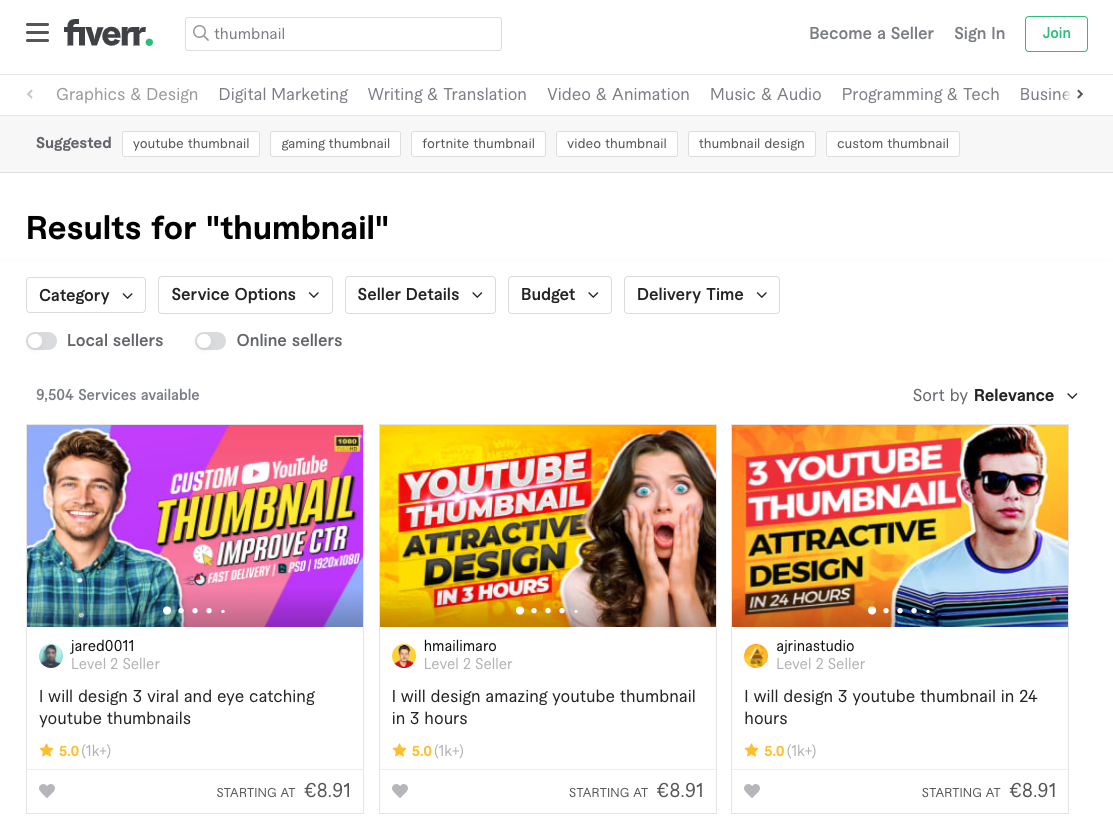
How to use Fiverr to create your first course thumbnail
The results that you will get are usually for YouTube thumbnails, but the same professionals will be able to create you a thumbnail for a course image without any problem.
Creating a thumbnail for online courses is a bit different than creating a YouTube thumbnail though, in the sense that a course image preferably has no text and it should follow a certain set of rules (more on this later).
If you want to be more specific in your search, and would like to find professionals with previous experience creating online course thumbnails specifically, then search for the keywords "udemy image" instead:
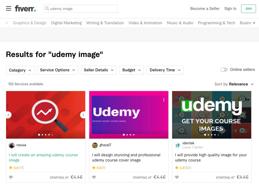
This will give us a lot more specific results that match exactly what you are looking for. These professionals know already how to create a good course image.
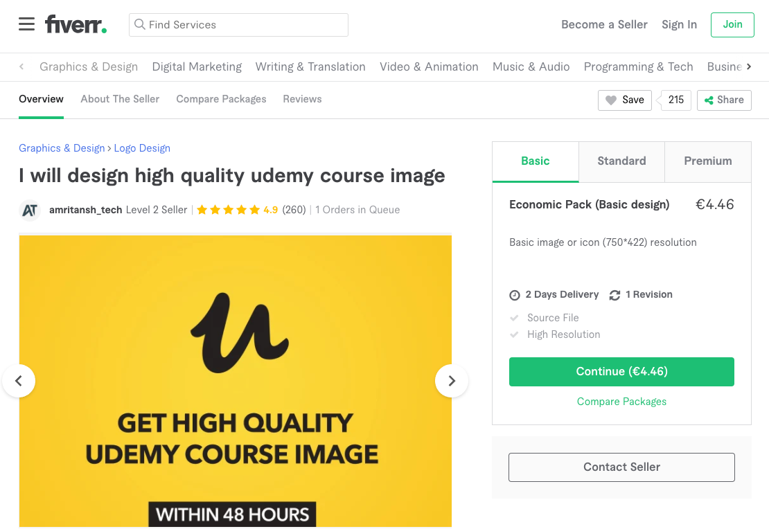
If you are looking for a specific seller, here is our current favorite designer (amritansh_tech), to whom we order all of our course thumbnails:
What are the technical specifications of the thumbnail?
For the technical specifications of the image, we recommend:
- Minimum required dimensions: 563 x 317 pixels
- File format JPEG
- non-transparent background
If you use different dimensions, make sure to keep this exact form factor, to avoid image distortion issues.
I recommend that you avoid using a transparent background for your thumbnail, to make sure that the thumbnail looks the same on all the pages of your website.
Why should you order also the source file for your course thumbnail?
We recommend ordering not only the course image, but also choosing the option with the source file, which might cost slightly more but it's well worth it.
A source file is for example a Photoshop (or equivalent) editable file that will allow your designer or other designers in the future to edit the thumbnail and create new versions of it if needed.
Online course thumbnail recommendations
In this section of our guide, we will detail all of the things that make or break a good course thumbnail.
We recommend that you send a link to this guide that you are reading to your designer and ask them to read the whole guide and especially this section so that they understand exactly what you are looking for.
Look out for mobile crop areas
Remember that the sides of the course image might be cropped out on mobile devices on certain platforms:
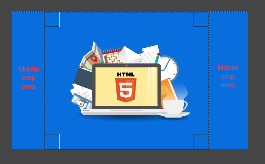
Do you see the sections of the page with the text "mobile crop area"? These might be removed on mobile devices, to save screen space.
In order to avoid any issues, put the important elements of the design right in the center of the thumbnail, and leave any important information out of the left and right edges of the design.
Choose relevant image elements
When a student sees the thumbnail for the first time, they should immediately associate it with the main course subject.
For example, if the course is about Excel, then the thumbnail should contain in a central position, an Excel icon.
We want to create an immediate visual association by showing the student an image that is very relevant to the subject at hand, preferably a very recognizable icon and the correct brand colors.
We don't want to overload the thumbnail with many small elements that are not relevant to the design.
Here is a good example of an Excel course thumbnail:
As we can see, in this example both the icons used and the brand colors are extremely relevant to the course topic.
When seeing this image for the first time, the student would create an immediate association between the course and its subject, and there would be no possible confusion about what is exactly the course about.
On the other hand, here is a bad example of an Excel course thumbnail:

In this example, the branding colors don't reflect the Excel brand. Also, although the Excel icon is included in the center of the design, there are many other distracting elements in the design that are not associated with Excel.
The student would be left wondering what is the course exactly about: accounting, manufacturing, transportation?
Although adding more things to the design is very tempting, all of those extra design elements are just distracting and take away from our end goal which is to create a strong visual association with the course topic.
You want to reduce as much as possible the number of visual elements, in order to make the message of the thumbnail more effective.
In design, less is more so if your designer proposes extra design elements to your initial design as they often tend to, you can ask them to provide a second version without those extra elements and reduce the design to its essentials.
Should I use text in a course thumbnail?
We don't think that it's a good idea to add text to your thumbnail, because it distracts the student from the course title.
The text might also look too small on smaller image sizes, and hide or obfuscate the visual message that we are trying to create with the rest of the thumbnail.
What about using stock photography?
You can also optionally use stock photography in your course thumbnail as a background image, but we recommend that you do this sparingly and with caution.
Make sure that it's a highly relevant image that further enhances the visual connection between the image and the subject of the course.
Avoid using generic stock images that are not directly related to the subject of the course, and avoid overloading the thumbnail with too many visual elements.
Here is a bad example of how stock photography can be used for an Excel course:

As we can see, the only thing in this image that is relevant to the topic of Excel are the charts on the laptop screen, but those are too small and it's hard to see that the course is about Excel at all just by looking at the image.
All the other elements on the screen, like the laptop, the pistachios, or the plant have nothing to do with the course subject and just feel staged and unnatural.
And what about good examples? We couldn't find many good examples of how to properly use a stock photo for an Excel course, we think that the plain green background in the logo above feels much more natural and effective.
Stock photography should only be added if it's hard to come up with a good thumbnail just using the main course icon and the brand colors.
Here is a more or less OK example of how to use a stock photo in an Excel course:

As we can see, the photo is used in second plan as a background, and there is a filter applied on top of it that makes the image look green (which is the main Excel brand color).
The photo creates secondary associations to an online course (via the computer), to a work environment (via the coffee mug and office), and to business (the person's suit). It makes the course look a bit more professional and official, which is a good thing.
These are good associations to create for an Excel course aimed at professionals working in large companies that need Excel training, so the stock photo could work well in this case.
Still, we think that it looks a bit staged, so in this case, we still prefer the example with only the Excel icon and brand colors shown previously.
But if you are going to use a stock photo in a thumbnail, this is the way to do it: put it in the background, ask the designer to apply a filter on top of it, and give it the brand's primary or secondary color.
When the use of a stock photo works, it works very well, but don't try to use it at all costs. Make sure to always ask for a revision without the stock photo, as a comparison point.
How to write the specifications for a course thumbnail
When ordering a course thumbnail from a professional designer, you will have to provide detailed written specifications for it.
It's critical to get this part right, otherwise, your designer will have no idea how to come up with a good image. Remember, the designer usually doesn't know anything about the course so he will try to add some generic elements to it like typically a computer, which is a huge cliché in online course thumbnails.
Getting exactly the image that you need is all about great written communication.
Even if the designer is familiar with creating online course images, make sure to include a link to this guide in the specs, so that they understand exactly what you are looking for.
We recommend that you start your message with a short introduction (one sentence or so) just explaining what is the main subject of the course.
After that, you should provide a bullet point item list with all the image requirements. We recommend requesting the following:
- add the desired image dimensions, with a minimum of 750 x 422 pixels and a 16:9 form factor
- don't use any text on the thumbnail, as it would distract from the rest of the text on the course page
- If the course is about a well-known brand like Excel, make sure to specify the brand colors, by including a picture with the specs or providing a link to it
- Make sure that you can use the brand colors for the course by checking brand licensing, this is usually OK but double-check just in case
- If your course is not about a particular existing branded product like Excel, choose two complementary colors that look great together, for example, some tones of red and blue.
- choose an iconic and easily recognizable image linked to the course topic, and place it well in the center of the thumbnail
- The thumbnail should have only one central element, which should be an icon or symbol that is linked to your topic.
- In design, less is more. There shouldn't be a lot of other elements in the design, that distract the student from what we are trying to communicate to them, which is the subject of the course
- If you do use a stock photo, you probably want to let the designer choose it for you, as they are used to it and will do it probably much better than you. We are paying them so let's make sure that they contribute with all their skills
- You want to avoid over-specifying the image requirements as well and leave some room for the creativity of the designer
Make sure that you ask the designer before they begin if they have any extra questions on their side.
How long does it take to receive the course image?
After a couple of days and sometimes even within 24h, you will receive the first iteration of the design.
You will know straight away if the image is the right one when you see it!
If your initial feeling about the image is that it's OK but not perfect, you might want to wait for an hour or so and look at it again.
Sometimes we are so caught up in the design process that it's hard to just finish it, and we might accidentally try to overdo it and end up with a worse result.
You might want to download the image and see it in different sizes to make sure that you like the design in smaller sizes especially.
If you are not happy with the initial design you can provide a list of modifications, and iterate on it until you are happy with the result. You usually have the right to 2 or 3 revisions, so you might as well use them if you are not sure.
You can purchase additional revisions as well if needed, but this is very rarely necessary if you get the initial specs right.
If you get a great initial design that you still want to try to improve even further, make sure to ask the designer to keep that version of the design, in case you want to end up using it after all.
What if my designer sends me an awful image?
If you approve an image and later come back on the next day and feel that it's not quite it, then start again with another vendor and try to explain better what you need.
In principle, this will not happen to you if you have followed the suggestions in this guide. But if it does, don't feel obliged to use a bad thumbnail.
We have thrown away a couple of bad designs ourselves that we never used. For $15 it's just not worth it for such an important part of your course.
Conclusions and key takeaways
Let's quickly summarize here everything that we have learned in this guide. Here is the main point:
If you want to get a great course image, it does NOT make sense to try to create it yourself unless you are a design professional.
A great image creates a strong visual association with the subject of the course, and it inspires or removes trust from the buyer in your course, so it's tremendously important from a sales perspective.
A good image costs only about $10 to $20 to create (with the source file included) on the Fiverr platform for example, where you can find great designers that already have experience creating thumbnails for online courses, so it's really a no-brainer.
In order to get the image that you want, it helps if you have some basic understanding of design in general. An important design rule is that less is more, so avoid overloading your design with too many elements.
Simply request the designer to add a central element to the design, like a brand icon for example. Then give a primary color and an accent color, and ask the designer to use them in the design, they will know what to do.
You might want to try to use a stock photo in a background with a filter applied on top of it, but be careful because this might end up feeling staged and unnatural.
Always request a version of the design without the stock photo and only the brand colors. We feel that this tends to work better in general for online course thumbnails, but it's just a matter of taste.
We hope that this guide has helped you understand how to create a course thumbnail.
In order to get notified when new content is available at the Course Creator Academy, you can subscribe here to our weekly newsletter:
And if you are looking for a platform to host your online courses, create an account at OnlineCourseHost.com and start creating your courses using our Free Plan.
Next recommended guide
To check out all our guides on how to become an online course creator, you can check the academy home page.
The next guide that we recommend that you read is: How to write a high-converting online course description
Any further questions?
If you have any other questions about online course creation in general or course thumbnail images in particular, please post them in the comment section below, or in our Course Creator Academy Facebook Group.
Either way, our team of course creation experts is happy to help you out.
Vasco Cavalheiro
OnlineCourseHost.com Founder & Online Course Creator
LinkedIn Facebook Page Facebook Group Twitter
You are welcome to ask me any questions in the comments below: 👇👇👇👇

 Start Here
 Course Creation Journey Step by Step
  Course Creation Software Reviews
 Online Course Marketing
 Course Creation Tips & Tricks
 Course Equipment
 Online Course Marketplaces
 Revenue Reports
 Best Practices
 Frequently Asked Questions
 Platform Reviews