


How to Create an Effective Online Course Sales Page
 Platform Review
Learn step-by-step how to create a high-converting online course sales page. Discover key elements, and design tips to attract and engage your audience, boosting your course sales and credibility."
Ever wondered why some online courses sell out while others barely attract any students? The key is often on the sales page.
Creating an effective online course sales page is crucial for turning visitors into students.
A well-designed page grabs attention, shows the value of your course, and inspires potential students to sign up.
Your course sales page is like your digital storefront. It's where people decide if your course is worth their time and money.
So, in this guide, I will show you how to create an online course sales page that not only looks good but also converts visitors into eager learners.
Let's dive in.
Table of contents
You can also check out all the free guides available at the Course Creator Academy by clicking on the Academy link on the top menu.
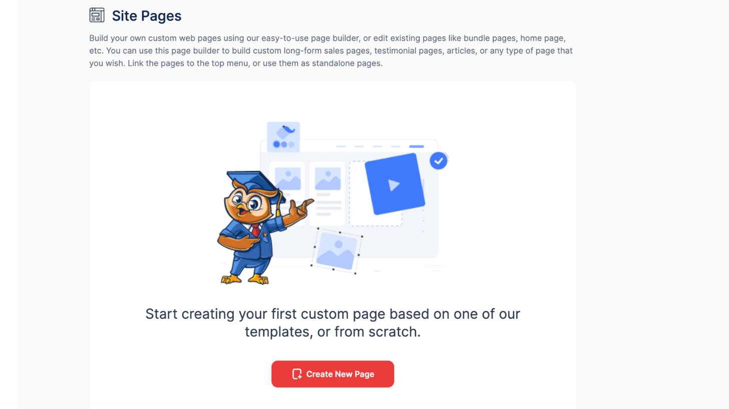
Build Your Course Sales Page Easily with OnlineCourseHost.com Page Builder
Making a sales page for your online course can feel overwhelming, but the OnlineCourseHost.com page builder makes it easy.
Let me break down the steps to get you started.
At the end of this tutorial, you will have created a fully customized course sales with the following sections:
- Header: The header's goal is to quickly catch the visitor's eye. It usually has a bold course headline, a catchy sub-headline, and a call-to-action (CTA) button, and it sets the tone for the page and invites users to explore more.
- Benefits: This section shows the main benefits of the course. It aims to convince potential students by highlighting what they will learn and how it can help their careers.
- Rich Text: The rich text section lets you give detailed explanations and share stories. It provides in-depth info about the course, like what it's about, and its goals, This helps convince people why they should sign up.
- Images: The images section improves the page's appearance and breaks up the text for easier reading. It can have graphics related to the course, instructor photos, and visuals of the course content. The goal is to make the page more engaging and informative.
- Video: The video section can have an intro from the instructor, course previews, or testimonials. Its goal is to make a personal connection and show off the course engagingly.
- Course Content: The course content section shows the curriculum, including modules, lessons, and topics. It aims to give potential students a clear idea of what they will learn and how the course is organized, helping them decide if it fits their needs.
- Course Cards: It gives a quick look at the available courses. Each card has a short description, an image, and a CTA button. The goal is to let users quickly browse and pick the courses they like.
- Call to Action: This section has buttons or links that prompt users to take action, like enrolling in the course, signing up for a newsletter, or asking for more info. The goal is to guide visitors to take the next step.
- Bundle Details: If you offer several courses together, this section gives details about the bundle, like what's included, the total price, and the benefits of buying it. The goal is to show the bundle as a great value option.
- Newsletter: This section asks visitors to join your mailing list. The goal is to gather potential students for future marketing and engagement.
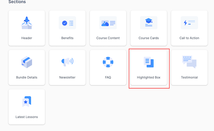
- FAQ: It answers common questions about the course. The goal is to clear up any doubts and help people feel confident about enrolling.
- Highlighted Box: This section highlights important information like limited-time offers, special announcements, or key features. The goal is to make sure these details stand out and catch the user's eye.
- Testimonials: It shares positive feedback from past students. The goal is to build trust and credibility with real success stories, making the course more attractive to potential students.
- Latest Lessons: This section shows the newest lessons added to the course. The goal is to prove that the content is up-to-date and always getting better, attracting new students and keeping current students interested.
- Custom HTML: This section lets you customize endlessly. You can add unique graphics, animations, or interactive content that standard templates don't support. The goal is to make the page more engaging and match your branding and course needs.
So without further ado, let's get started!
Logging In and Accessing the Page Builder
First, log in to your account on OnlineCourseHost.com, and if you don’t have one yet, go ahead and sign up at OnlineCourseHost.com.
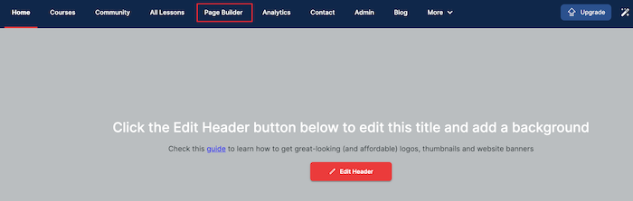
After logging in, click on Page Builder. This is where you can create and manage all your sales pages.
Then, click on "Create New Page."
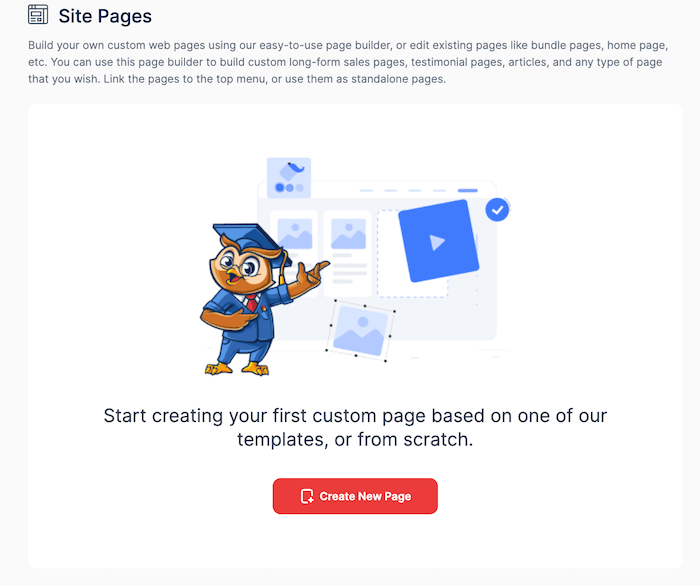
Choose the blank page to start creating your online course sales page with the sections I mentioned earlier.
Don’t worry that you're starting from scratch—a blank page holds limitless possibilities, which I am about to show you.
Next, fill in the basic information for your page:
- Page Title: This is the main heading that will appear at the top of your page.
- Page Description: Write a brief summary of what the page is about. This helps visitors understand the purpose of the page quickly.
- Unique Page Path (URL): Create a unique URL for your page. This should be short and easy to remember.
Note that whatever you enter in this box will be added to your website's URL to create a link for that page. If your path has more than one word, use dashes (-) instead of spaces.
Then, click "Create Page." to begin.
Add Your First Page Section
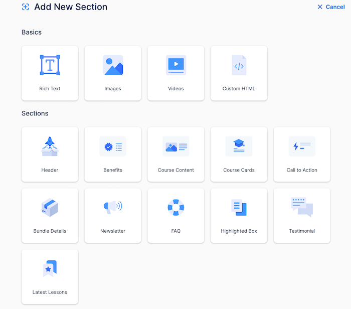
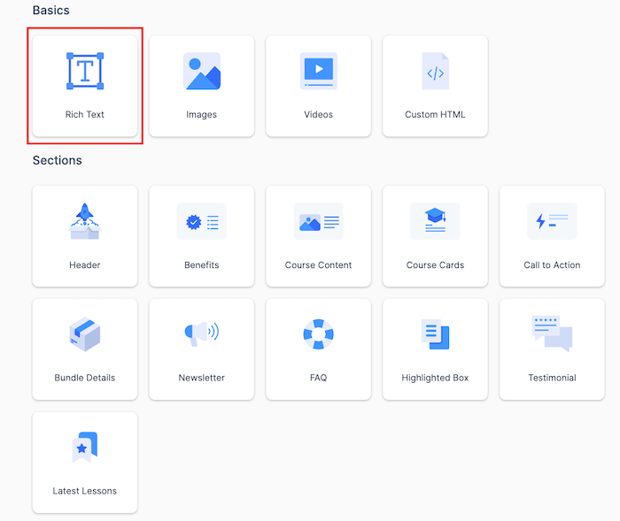
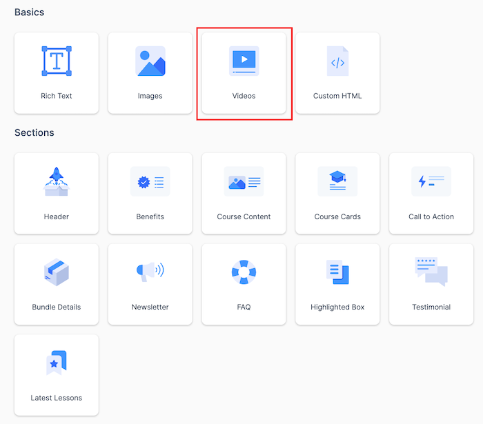
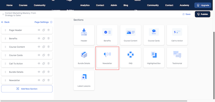
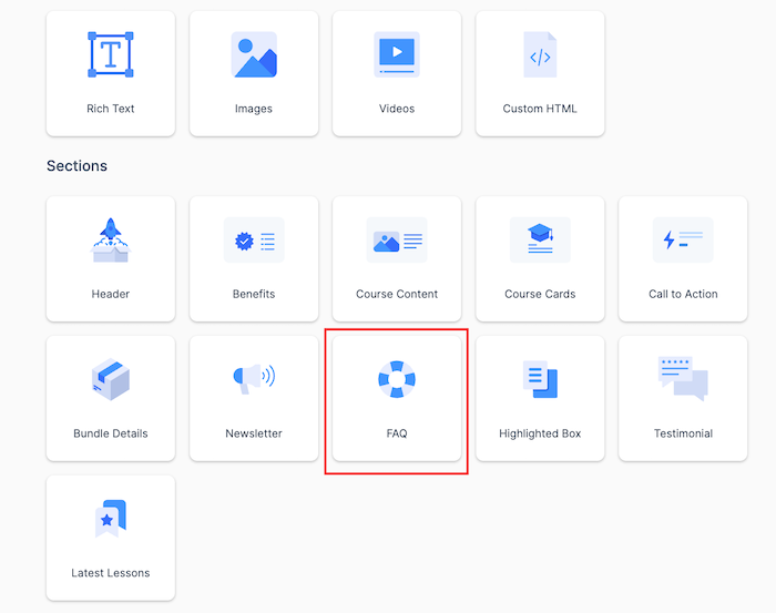
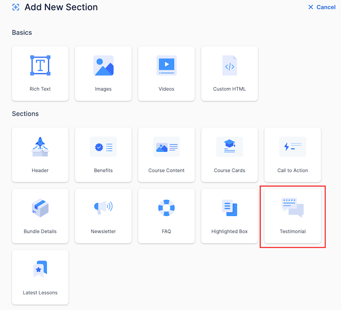
It's time you start adding sections to build your page. Start by clicking the "Add New Section."
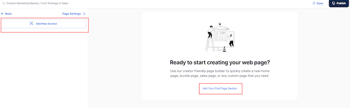
You'll see a list of drag-and-drop options that you can use in creating your online course page exactly the way you want it. See image below:
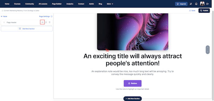
Header - Make a Great First Impression
Your headline is the first thing visitors will see, so it must immediately grab their attention.
To captivate your audience right from the start, aim for a clear, concise, and compelling message that immediately communicates the core benefit of your course.
Here's how to create a header that hooks your visitors
- Click on "Header" to start customizing your header section.
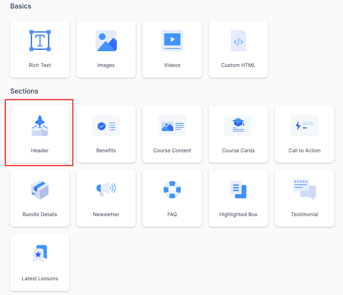
- It displays the header template as shown below:
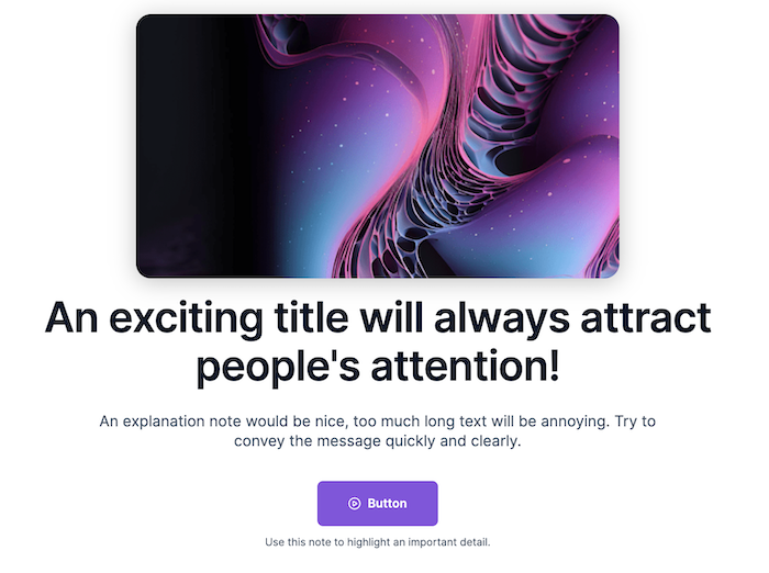
OnlineCourseHost.com lets you design your course sales page heading however you want.
You can:
- Choose color
- Set text alignment
- Choose background color and image and more👇
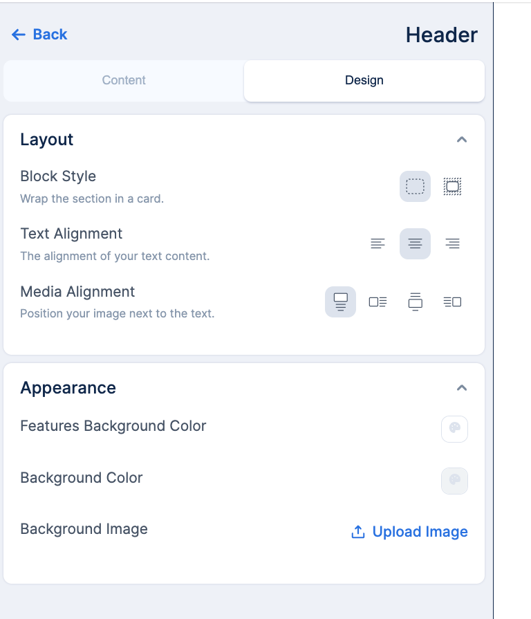
To start editing, click the eye icon on the left side of the screen.
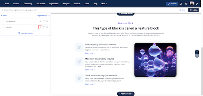
Benefits - Why Your Sales Page Matters:
This section should clearly tell what students will gain by enrolling in your course. To set up your online course benefits section, click on "Add New Section, then "Benefits".
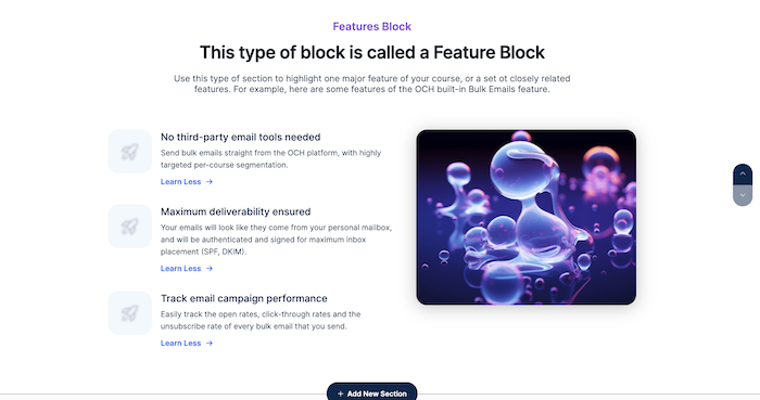
Just like the "Header", you can customize the "Benefits" section to your taste by clicking the eye icon.
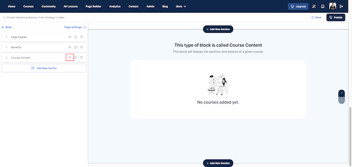
Course Content - Setting up Your Online Course Content Section:
This section is important for giving potential students a clear idea of what they will be learning, module by module, and building anticipation for the value they will receive.
To set it, click on "Add New Section", then "Course Content".
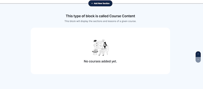
Then, click on the eye icon to edit it to your taste.
Rich Text: Using Text to Make Your Course Stand Out
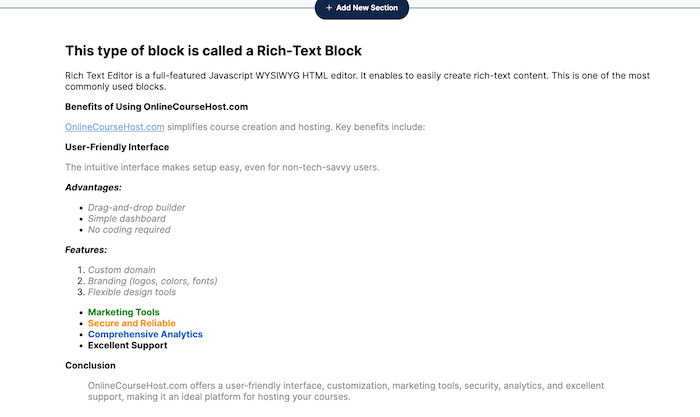
This section allows you to use various text styles and formats to highlight important information about your course. For example, you can use bullet points, you can add emphasis with Bold and Italics.
Here's how to set it up:
- click on "Add New Section",
- and then click on "Rich Text".
- Then, click on the eye icon to edit it to your taste.
Image Section: Making Your Course Visually Appealing
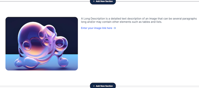
Adding an “Image Section” can make your course page more appealing.
Also, clear, high-quality images can give potential students a visual understanding of what they can expect.
Here’s how to set it up:
- click on "Add New Section",
- and then click on "Images"
- Then, click the eye icon to edit the alignment, background color, block style, and content.
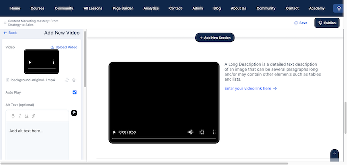
Video Section: Engaging Your Audience with Dynamic Content
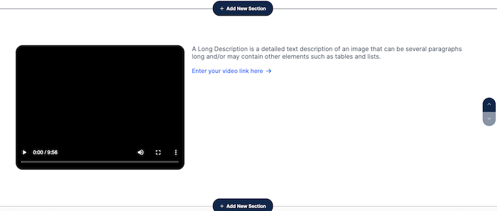
Adding a “Video Section” to your online course sales page can really capture attention and make your content more engaging.
Videos can show enthusiasm, provide clear examples, and help potential students connect with you better.
You can set it up by:
- clicking on "Add New Section",
- clicking on "Videos"
- Click the eye icon to upload your video, its alt text, description, border color, and more
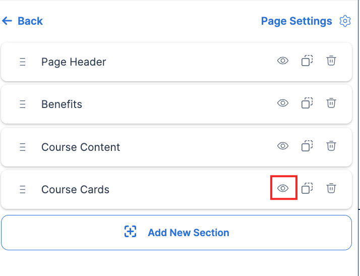
Course Cards - Displaying a List of Your Course Cards:
Your course cards should be visually engaging to draw the visitor’s attention.
You should use high-quality images or icons relevant to the course topic. And, ensure each card is consistent in design to maintain a cohesive look across your sales page.
To set up your course cards section, click on "Add New Section", then "Course Cards".
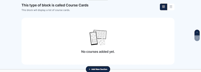
Click the "Add New Section," followed by selecting "Course Cards." to set it up. Then, click on the eye icon to customize it to your preferences.
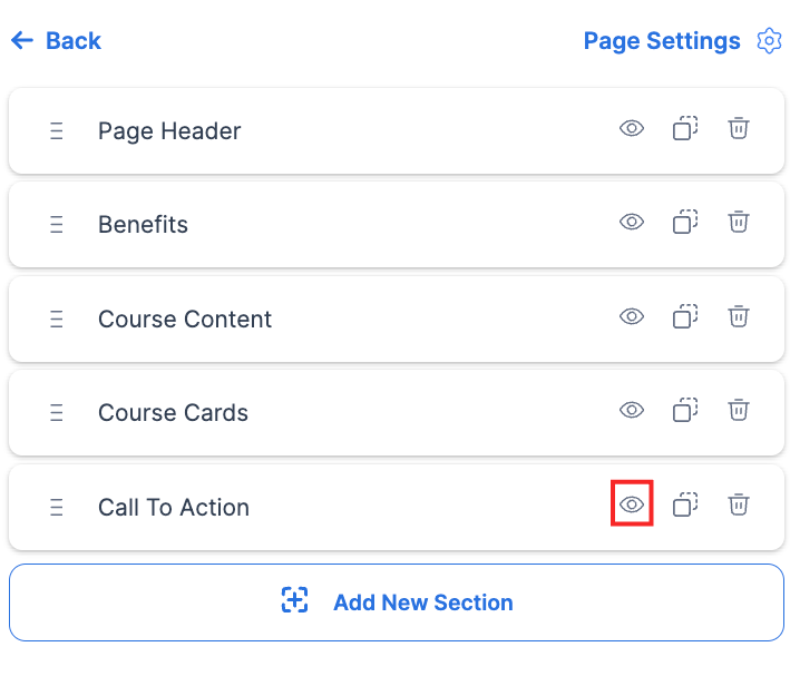
Call to Action - How to Create a CTA that Converts Visitors into Students
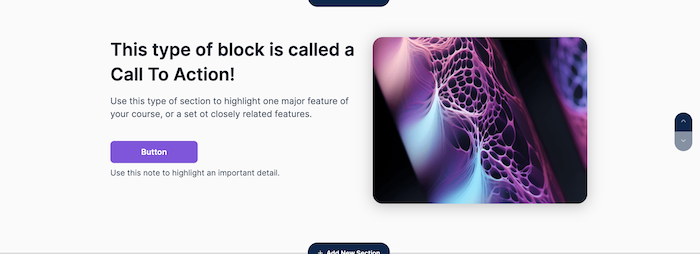
Once you've grabbed your audience's attention with great visuals, content, and value, guide them to take the final step: taking action, using a strong Call to Action (CTA).
Here's how to create a CTA that converts visitors into students:
- click on "Add New Section",
- and then click on "Call to Action".
- click on the eye icon on the left side of the screen and customize it to your preferences.
Make your call to action (CTA) button clear and eye-catching by using bright colors. Avoid making it small or hiding it in a corner.
Also, you could put your main CTA button at the top of the page where people will see it right away. You can also add it throughout the page to catch attention at different points.
Bundle Details - Maximizing Value for Your Students
People love a good deal. That's why offering a bundle of courses with a discount is a smart way to attract students.
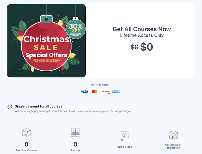
Briefly explain what's included. Mention enticing details like the number of courses, the topics covered, and the value - it saves money, or it comes with bonus resources!
Here's how to set up a bundle detail:
- click on "Add New Section",
- and then click on "Bundle Details".
- To configure it, click on the eye icon on the left side of the screen and customize it to your preferences.
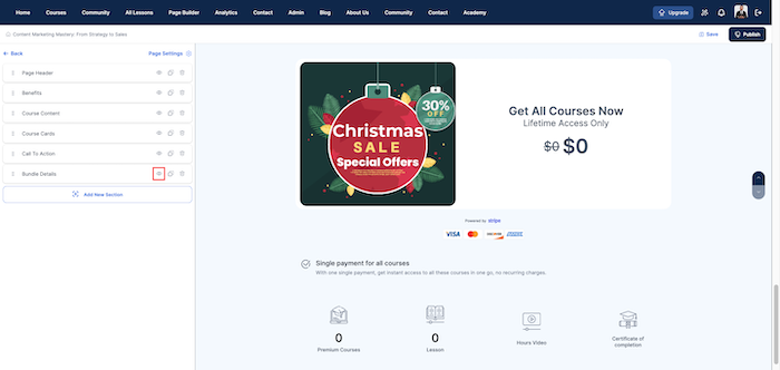
You can edit the headings, button text and colors, images, expiration date banner, payment options, and more.
Newsletter Section - Keeping Your Audience Engaged and Informed
Adding a newsletter signup to your sales page keeps potential students interested, even if they're not ready to buy yet.
Here’s how to set up a newsletter section on your sales page.
- click on "Add New Section",
- and then click on "Newsletter".
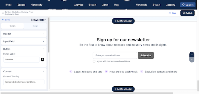
- To configure it, click on the eye icon on the left side of the screen and customize it to your preferences.
You can also customize the
- Input Field
- Button for the subscription.
- Benefits and benefits icon
- the layout of your page, desired color, or an image for your background.
FAQ - Setting Up Your Frequently Asked Questions Section
One often-overlooked but incredibly powerful element on an online course sales page is the FAQ (Frequently Asked Questions) section.
Here's why integrating a well-crafted FAQ can be a game-changer for your course sales:
- Builds Trust and Credibility
- Reduces Purchase Anxiety
- Improves User Experience
- Saves Time
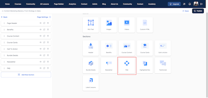
You can set it up on your online course sales page by:
- clicking on "Add New Section",
- clicking on "FAQ".
You can also click on the eye option and configure the following:
- Header with your title and description.
- Questions and answers.
- Image list icons.
- Layout and appearance.
Highlighted Box Section - Shine a Spotlight on Your Promotions
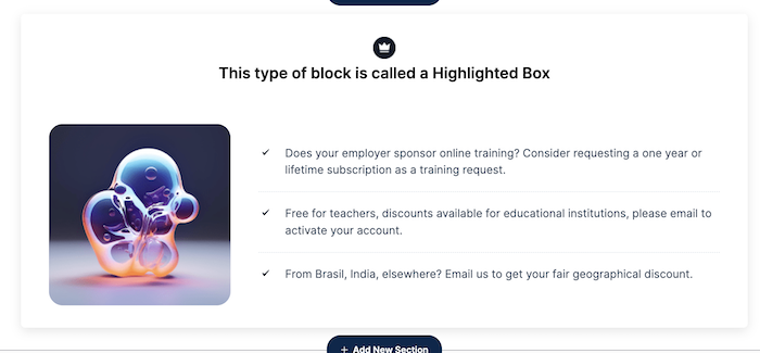
The Highlighted Box Section is an excellent feature for showcasing key deals and unique course offerings for your online course.
Here is how to set it up:
- click on "Add New Section",
- and then click on "Highlighted Box".
You can also click on the eye option and configure the following, just the way you want it to look:
- Block style
- alignment
- Hero image
- Layout
- Background color
- Background image and others.
Testimonials - Building Trust and Credibility
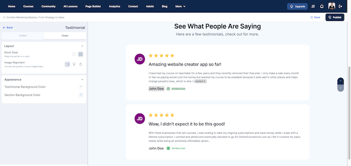
Don't forget testimonials on your sales page! They convince potential students your course is worth it.
Also, the best testimonials tell a story. It feels real when past students share their experiences, struggles, and successes with your course.
These stories help people imagine themselves getting the same results and make them want to enroll!
Here is how to set it up:
- click on "Add New Section",
- and then click on "Testimonial".
Click on the eye option and configure the
- alignment
- Hero image
- Layout
- Background color
- Background image and other features.
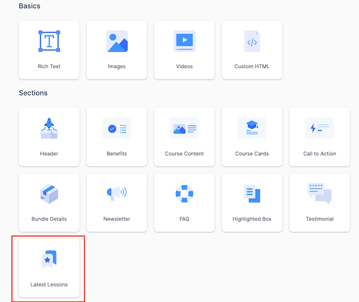
Latest Lessons: Keeping Your Content Fresh and Engaging
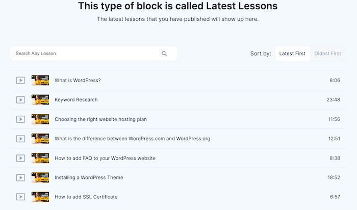
This part of your course sales page highlights the newest content, showing visitors that you’re dedicated to offering the latest and most useful information.
People want to learn up-to-date and relevant things, so this section assures them they’re getting fresh content that aligns with the latest trends and practices.
Here is how to set it up:
- click on "Add New Section",
- and then click on "Latest Lessons"
At the left-hand side of your screen, click on the eye symbol, next to "Latest Lesson" to configure the number of lessons you want to be displayed, block style, background color, and more.
Custom HTML Section: Enhancing Your Page with Flexibility and Creativity
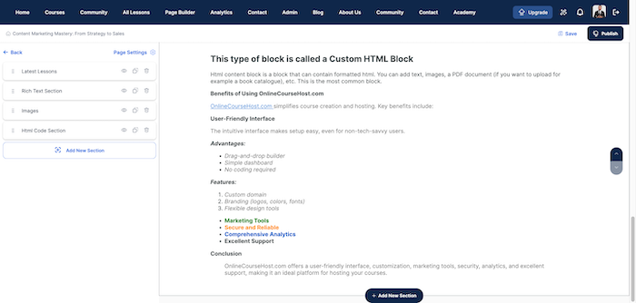
Adding a "Custom HTML Section" allows you to customize your page with elements that standard templates might not support.
Such as custom graphics, animations, or even simple games that make your page more lively and engaging.
Here's how to set it up:
- click on "Add New Section",
- and then click on "Custom HTML"
- Click the eye icon to upload your video, its alt text, description, border color, and more.
Conclusion
Creating an online course sales page for your online course doesn't have to be difficult. The OnlineCourseHost.com page builder gives you all the tools you need to make a page that looks great and excites potential students.
Take your time with each section. Think about what your potential students want to know and make sure your page answers their questions.
With some effort and creativity, you can create an online course sales page that turns visitors into eager students. So go ahead and give it a try, and watch your course sales grow!
Note that the page builder can also be used to create the home page and bundle page.
I hope you find this post helpful, and to get notified when new content is available here at the Academy, you can subscribe here to our weekly newsletter:
If you are looking to ask any questions on online course creation, you can reach me here on my Facebook group:
Join the Course Creator Academy Facebook Group
Ready to learn how to launch your first coaching program or course on OnlineCourseHost.com? Here are the helpful guides for you to check out:
- Best Online Course Platforms (Ultimate Guide)
- How To Choose An Online Course Topic That Sells
- How To Record And Edit Your First Online Course
- Affordable Online Course Equipment - Complete Practical Guide
- How To Hire An Online Course Team
- The Ultimate Online Course Launch Checklist
- How To Create The Perfect Online Course Sales Page
- Create A Powerful Brand For Your Online Courses (In 5 Steps)
- How To Sell Online Courses? The Ultimate Guide
- How To Promote Your Online Course - Complete Guide
Let me know in the comments below what other topics you would like me to cover or any questions that you have.
Thanks for reading… and enjoy the course creation process! 😉
Course Creators Academy, a community by OnlineCourseHost.com
Founded by Vasco Cavalheiro
Online Course Creator

 Start Here
 Course Creation Journey Step by Step
  Course Creation Software Reviews
 Online Course Marketing
 Course Creation Tips & Tricks
 Course Equipment
 Online Course Marketplaces
 Revenue Reports
 Best Practices
 Frequently Asked Questions
 Platform Reviews