Top 15 Online Course Sales Page Examples
 Platform Review
Learn from the most successful course creators how to build the perfect online course sales page. See proven examples of what an effective online course sales page looks like.
As a course creator myself, I tend to spend at least one full day, if not more, creating the perfect sales page for my online courses from scratch.
I don't hire any copywriters and do everything myself because who would know and understand my own audience better than I, right?
I think many course creators underestimate the value of having a great sales page just because they have a great course.
The fact is, your sales page is the most important determining factor of your conversion rate. Your students will make the decision to buy or not your course based almost solely on the content of your course sales page and nothing more.
To effectively sell your course and persuade your audience to buy it, you need a course sales page that contains all the right elements.
But what makes a great sales page? The best way to understand this is to analyze and learn from the sales pages of some of the most established course creators out there.
And that is why, in this article, I will look at 15 of the best online course sales page examples from some of the most popular course creators on the internet!
We are going to analyze each one of these examples, see what makes them work so well, and learn what we can apply to your own course sales page.
So, without further ado, let's dive right in!
You can also check out all the free guides available here at the Course Creator Academy by clicking on the Academy link on the top menu bar.
And here are some of my other posts related to the online course sales page that you might want to check out as well:
1. Quantum Growth
Created by: Sabri Suby
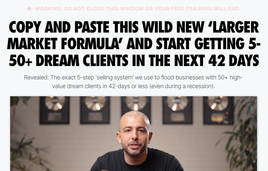
This is a powerful sales page by Sabri Suby, founder of King Kong, one of the world's fastest-growing digital marketing agencies. He is also the best-selling author of the book Sell Like Crazy.
This page uses a combination of good graphics and images to make it glow. As you load it, you are greeted with a big-promising headline, an attention-grabbing video, and a bold call to action.
Warning: If you watch this video to the end, you will probably end up pulling out your credit card to sign up for the offer. No joking.
The video, which is 1 hour long, begins with Sabri making a bold statement, highlighting the problems with most people's marketing funnels. He uses this as a hook to draw the audience's attention. As he continues to agitate over these problems, you're probably unable to stop watching at this point.
Shortly after, he introduces a solution. This is a classic example of the PAS [Problem-Agitation-Solution] formula by the legendary Dan Kennedy for creating an effective sales page.
The rest of the video is an interesting piece as he tells a transformational and relatable story of his journey, identifying with the audience's situation to connect with them on a deeper level. His message shines through as he transitions between several elements, such as social proofs, testimonials, and so on, with clear facts and figures, always finding a way to connect everything back to the solution, carefully detailed in a compelling manner.
Finally, the video ends with an effective call to action in which he calls out to a clearly defined audience to sign up for an irresistible offer. The rest of this page is filled with numerous social proof and all sorts of testimonials.
2. Copy School
Created by: Joanna Wiebe
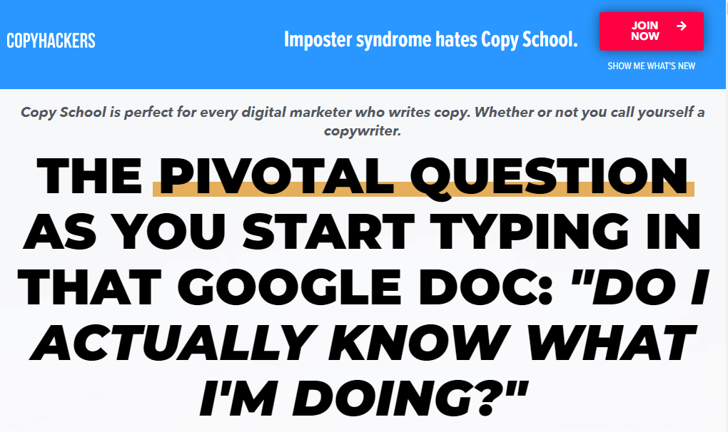
Joanna Wiebe is well-known for her Copy School Program. It's comprehensive training for digital marketers, eCommerce businesses, agencies, and anyone who writes copy, whether or not they identify as a copywriter, to help them sharpen the copy of their sales and marketing assets.
As you can expect from this page, the copy is very clear and compelling, with a conversational tone. It has all the perfect elements of a high-converting course sales page and more, starting with a bold heading and subheading that immediately convey who the course is for and how it can help them.
Although it is a long read, if you scroll down a little, you will find a short but detailed video from Joanna that provides an excellent overview of the course.
The best part of this page, for me, is the breakdown of the course content, which details each benefit in a clear and compelling manner. This content goes deep into key areas of copywriting, such as sales pages, nurturing emails, funnels, upsells, homepages, and more, with visual representations of each on the page.
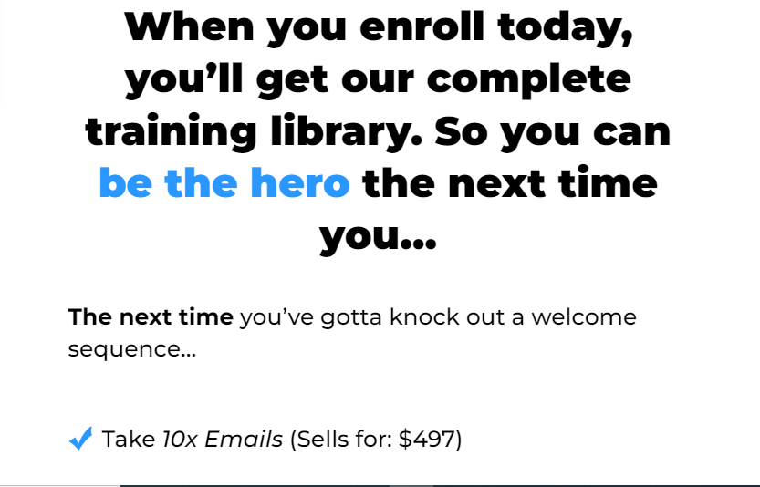
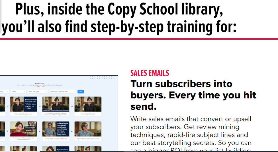
What's more, it uses lots of detailed testimonials, some of which are from high-profile clients, as well as bold claims to boost credibility. You're probably sold on the course by this point. But that's not all; there's also a clear FAQs section that effectively addresses several questions and objections you may have, leaving you with no choice but to enroll.
Finally, you will also find multiple Calls to Action with a clear visual design that makes you want to pause and take action.
3. The Habits Academy
Created by: James Clear
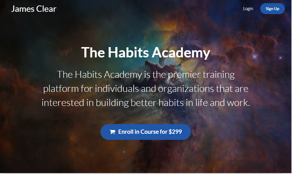
The Habits Academy was founded by James Clear, who is well-known for his research into habits and the science behind developing the right ones to propel you toward success.
This sales page reveals a powerful message that takes readers on a journey.
James begins with a thought-provoking statement in which he asks readers to imagine two versions of themselves five years in the future, one representing what life would be like if they continued repeating the same bad habits every day and the other representing what life would be like if they simply stuck with good and effective habits every day. He then paints several images of how our daily habits can have a compounding effect on the outcome of our lives over time, whether positive or negative.
In a positive way, James employs powerful psychological triggers, appealing to emotions and a strong desire for self-improvement. He goes further to present the ideal solution for achieving this desire. This is what distinguishes great copywriting!
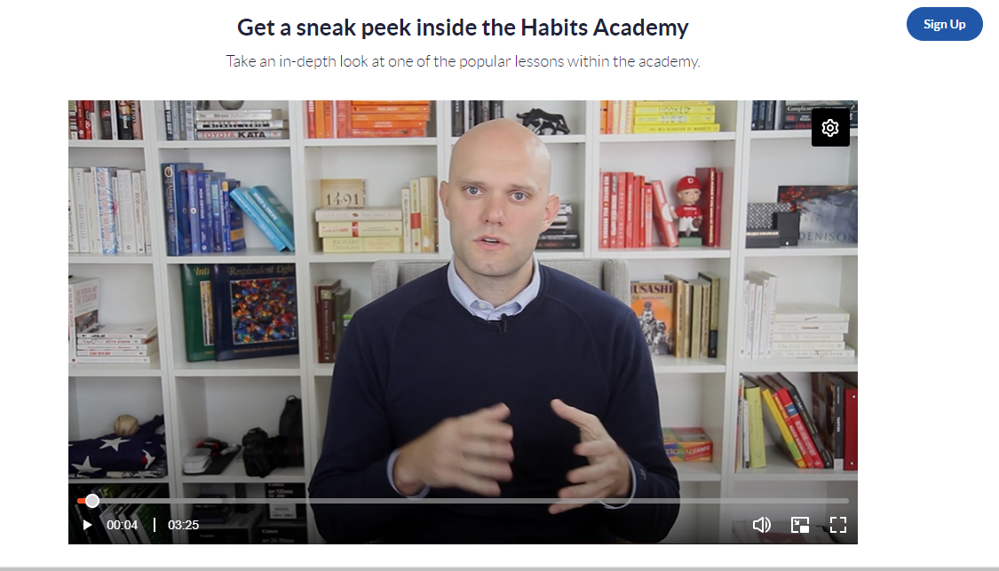
One interesting feature of this page is that it gives the audience a sneak peek into the Academy by displaying one of the Academy's popular lessons. This, I believe, will arouse their interest. Moreover, by stating in clear terms the life-changing benefits they would receive by enrolling in the Academy, coupled with lots of powerful testimonials, I can imagine at this point, the audience is left with no other choice but to hit the sign-up button.
4. Station X Cyber Security School
Created by: Nathan House

Station X has been a leading provider of cyber security training, consultancy, and services since 1999. Station X Cyber Security School offers comprehensive online cyber security training for security professionals and aspiring security professionals.
This sales page welcomes you with an eye-catching headline with a great design and graphics with nice layouts.
The video that follows is a 4-minute introduction to the VIP membership program. In this video, Nathan House, the CEO, and Founder persuade the audience to join the VIP membership by incorporating powerful elements of authority, social proof, testimonials, and benefits, one of which includes certifications as an additional asset for members upon completion of each course.
But that isn't even the best part.
The use of the AIDA [Attention-Interest-Desire-Action] framework to create a natural flow of attention down the page is something I find intriguing.
Nathan stirs the interest of the audience by highlighting a high global demand for Cyber Security professionals, citing over 300,000 job openings in the United States alone. In order to create more desire, he triggers a powerful human emotion (greed) by stating the great salaries top companies offer to these professionals.
Furthermore, he describes in detail what a fantastic opportunity this problem-global shortage represents for the audience looking to get started in cyber security, and then he presents the ideal solution via an effective call to action.

If that isn't compelling, then I don't know what is.
Another feature that I find unique about this page is the use of the live chat feature, which allows the audience to ask questions and receive prompt responses.
5. Graphic Design Mastery
Created by: Lindsay Marsh
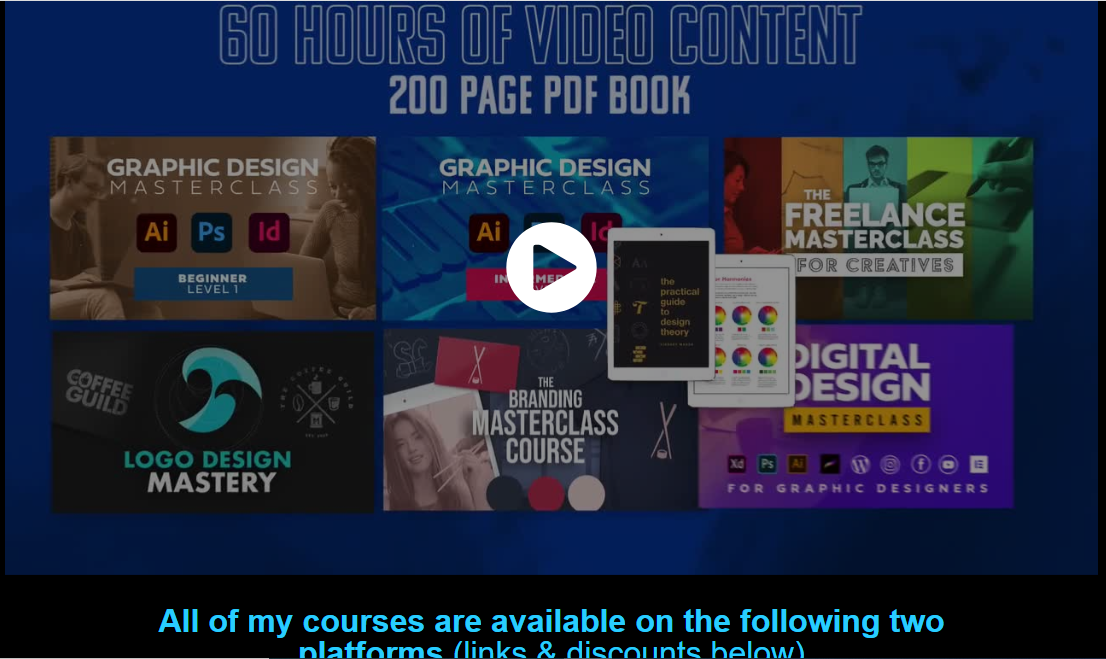
This page is an example of a great sales page that gets the job done.
What becomes immediately noticeable here is the creative use of beautiful graphics and design throughout the entire page. It uses a lot of contrasting colors, custom graphics, and illustrations and manages to balance it all together very well. I imagine the audience thinking, "Wow! what a fantastic design".
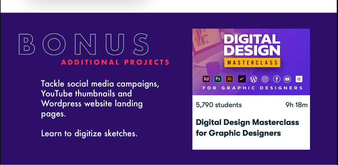
In most cases, this approach may not exactly follow the rule of thumb for creating a high-converting sales page, as it tends to divert the audience's attention away from the offer, which is the most important element. But, when you consider that the page itself is for a graphic design course, then it's easy to see why that is not a problem.
At the top of the page is a one-minute video that introduces the audience to the program. It provides a brief description and outline of what to expect from the course. At the same time, another video at the bottom of the page provides a breakdown of the various features and levels in the course, as well as the benefits each student can expect to receive at each level. There's also a bonus included to further sweeten and add more value to the offer.
Overall, I think this is an excellent online course sales page example for this type of offer.
6. Business Training University
Created by: Grant Cardone
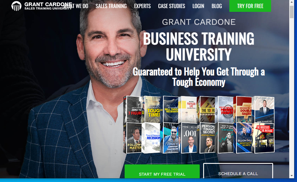
Grant Cardone is the bestselling author of The 10X Rule, and If You're Not First, You're Last. He is also a sales trainer, speaker, and entrepreneur who has worked in real estate and the auto industry, building a $5 billion portfolio of multifamily properties from scratch.
In his business training university, Grant offers Sales and Business training to individuals, professionals, teams, and organizations across various fields to help them grow their skills and scale their businesses.
The simplicity of this page is what makes it appealing to me. There are no distractions. The message is concise and clear, with good graphics. The fact that you can schedule a call directly from the page makes it even more user-friendly.
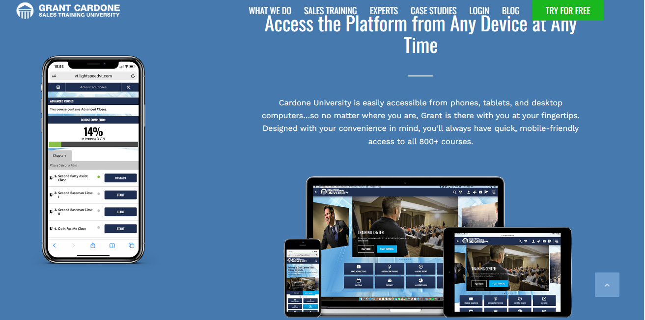
Furthermore, the offer is great, and it comes with certifications as an extra asset, as shown on the page. With over 1 billion lessons taken and almost 400k active users, that's a huge credential you cannot ignore.
Video testimonials from clients are another strong feature that makes the page compelling.
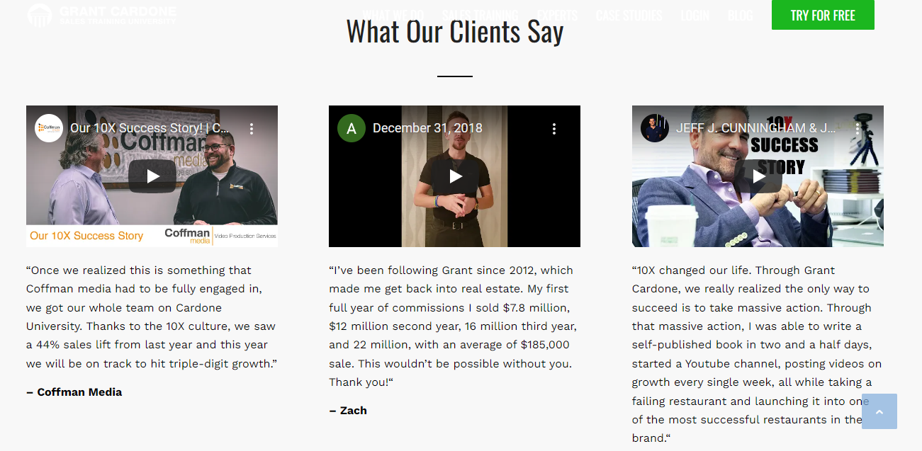
Videos are a great way of adding customer voices to your sales page, providing legitimacy and a personal touch that written testimonials lack. You can expect that testimonials done using videos and images are usually more believable than those in texts.
7. The Shinzo Chef Knife
Created by: PaleoHacks
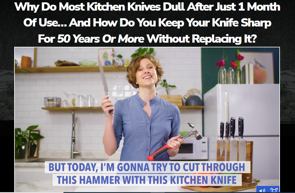
This is not a course like the others on the list. But the sales page is so compelling that I couldn't resist adding it.
The Shinzo Chef Knife is an all-purpose 8-inch masterpiece crafted in the Far East from steel made with Japanese-inspired techniques.
Again be warned; if you visit this sales page, you will most likely end up pulling out your credit card to purchase a Shinzo chef knife.
The copy is crystal clear, magnetic, and hypnotizing. The page contains all of the key components that you would expect from a high-converting sales page.
From the very strong headline that will arouse your curiosity to the video that draws you in from start to finish, an irresistible offer, call to action, and so on, you may find yourself unable to resist purchasing this product.
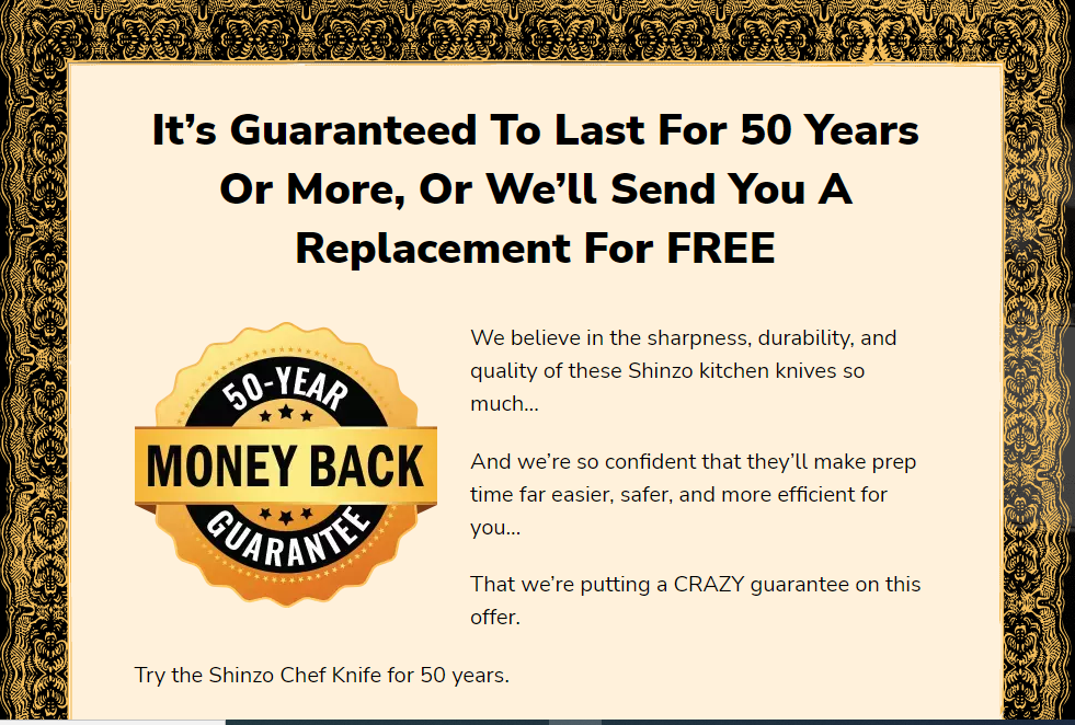
What's further outstanding about this page is the risk reversal section. Usually, Most Products will offer between a 30-90 day money back guarantee, but with a 50-year guarantee on this, that's unprecedented! You can't possibly compete with that level of assurance.
8. Ning Li Copy Coaching Program
Created by: Ning Li
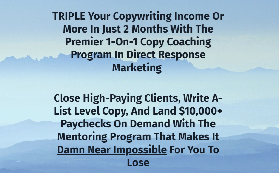
This is a lengthy sales page, but if you stick around long enough, you'll be forced to enroll in the coaching program. That's how powerful the copy is.
This page welcomes you with a big-promising headline and sub-headline that commands a natural flow of attention, followed by a video that encourages you to read all the way through.
And this is where the magic happens!
The sales page is a simple one with a simple layout. It has just the right balance of clear copy and images, proving that sometimes, simplicity is genius!
It is packed with various testimonials and proofs from Ning's students and other A-list copywriters, lending credence to his authority in the copywriting space.
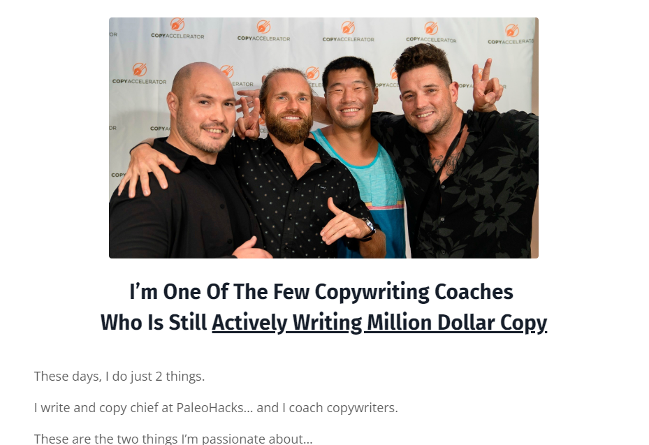
How he brilliantly transitions from establishing authority to communicating his message to a clearly defined audience and back again is what perfectly describes a great and compelling copy. Furthermore, he breaks down what makes for a high-income copywriting into three core areas which just shows that he clearly knows what he's talking about!
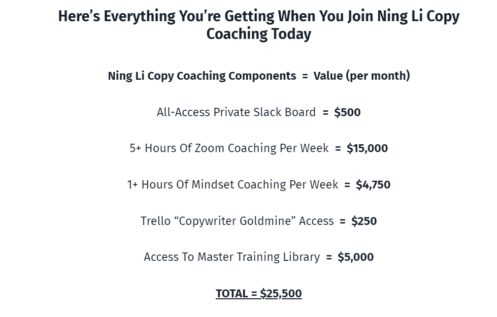
Lastly, the page ends on a strong note with some psychological tricks. He stacks the price to increase perceived value, then adds scarcity to the offer before concluding with an effective call to action. If you are a copywriter looking to upgrade your skills, I highly recommend that you sign up for this program.
9. The Art of Copy
Created by: Dan Lok
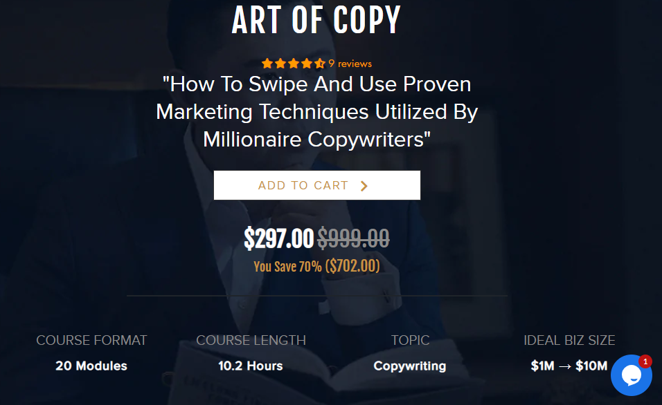
Look no further if you want to learn how to copy and use proven Marketing techniques used by millionaire copywriters. The Art of Copy by Dan Lok is exactly what you need.
Dan Lok is regarded as one of the world's foremost authorities on marketing, sales, and business. He was a self-made millionaire by the age of 27 and is now an 8-figure (growing to 9-figure) entrepreneur.
This sales page design is light and simple. It is yet another example of a simple design that gets the job done with a clean layout and minimal images and graphics.
Dan shows visitors, using a clear, detailed features and benefits list, how exactly this course can help them achieve the results they desire.
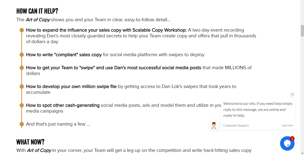
One very interesting element that stands out on this page is the use of Live sales notifications. This helps to create a sense of urgency, which encourages visitors to avoid missing out.
Finally, another interesting feature is the live chat section, where you can ask questions and receive responses in real-time.
10. The Foreign Copywriting Initiative
Created by: Andy Mukolo
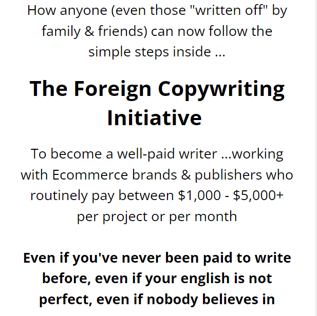
This course sales page is most likely the longest on the list, and it's not because it's full of fluffs. On the contrary, each element used on this page is like a vital piece of a tasty pizza!
With an engaging conversational style copy, it is emotionally charged and connects deeply with the readers. It also includes all of the sections you'd expect to find on a high-converting sales page.
One thing that stands out throughout the page is how Andy backs up each claim with numerous testimonials and proofs to increase credibility.
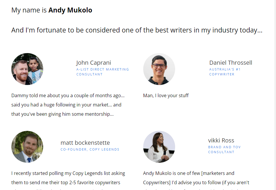
It's not the features of a course that sells it; it's how effectively you can communicate its benefits. Andy does an excellent job of this by clearly outlining the course's benefits and numerous resources. In addition, it includes some mouth-watering bonus packages, making the price negligible in comparison to the huge value students will be getting.
Many course creators include a money-back guarantee on their sales page, but this is different. It may come as a surprise to some visitors at first, but as you read on, it becomes clear that it isn't such a big deal.
Finally, as you near the end of this page, you will come across the FAQ Section, where several objections are addressed, before calling the audience to action with a big, bold button that reads "Join the F.C.I class of 2022."
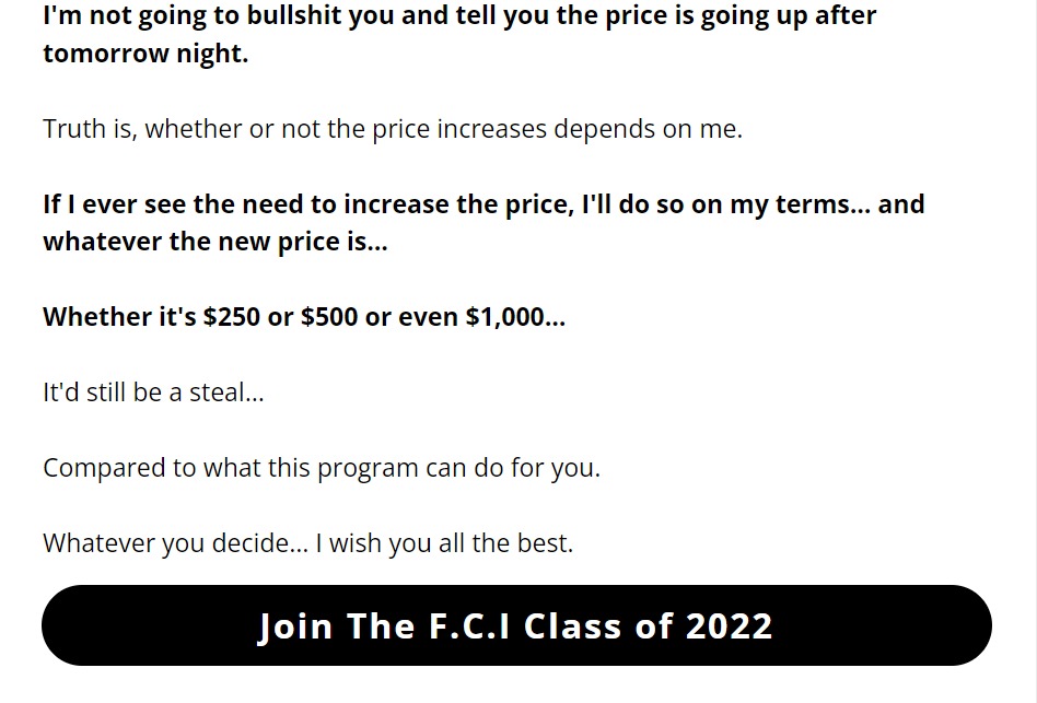
The page concludes on a powerful note with many more testimonials and proofs. Despite the lengthy text, I believe this sales page is an excellent one.
11. Instagram Domination
Created by: Foundr
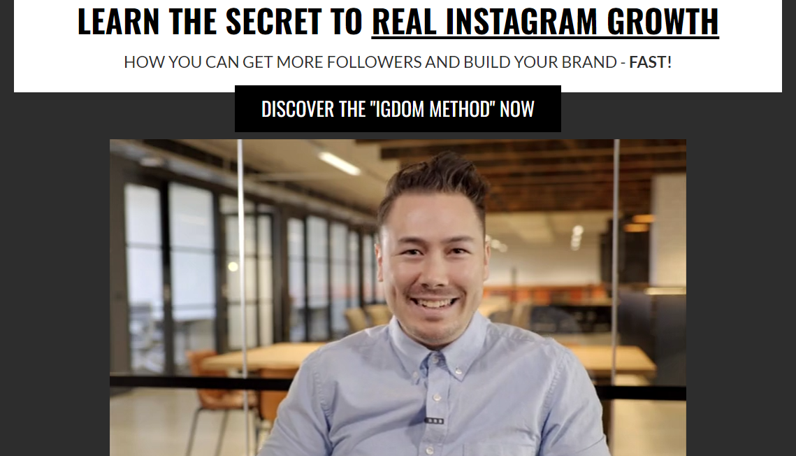
Instagram Domination course was created by Foundr's CEO - Nathan Chan. Foundr is an entrepreneurship magazine that has been around since 2012. This course is packed with actionable steps to follow for any brand looking to expand its business using Instagram.
At the top of this sales page is the hero section, a 2-minute introductory video in which Nathan shares a brief description of the company's journey and how Instagram has been a major tool for their success.
What's most noticeable throughout the page is the use of video testimonials, which is an interesting approach. This helps to show the impact the course has had on existing customers who have enrolled in it. Not only that, but he also includes quotes from top personalities such as Gary Vee and Michael Stelzner to boost credibility.
Another interesting thing is how Nathan brilliantly communicates the features and benefits of this course to the audience in a convincing manner while also adding exclusive bonuses worth over $1000 to sweeten the offer.
Furthermore, while many course creators use a similar approach for their FAQs section, Nathan takes a different approach. In an unusual twist, he responds to some of the questions with real-life examples and video testimonials that provide all of the evidence or proof the audience needs.
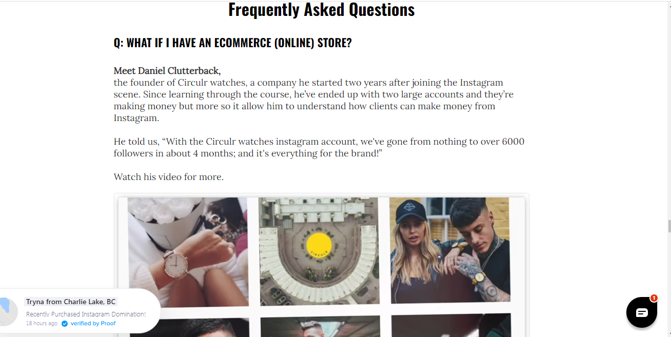
What's great about this approach is that it shows just how Foundr can go beyond mere words and how the course it offers can deliver the results that people expect.
Finally, the live chat feature and live sales notification on this page are excellent tools for creating a sense of urgency and inducing the audience to act.
12. Chalk Performance Training
Created by: Ryan Fischer
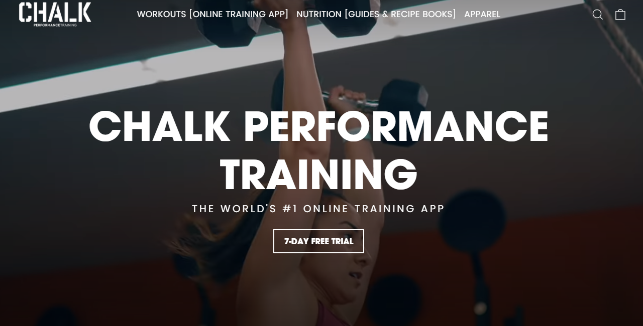
Check out this sales page if you've been struggling to get in shape and want someone to create an innovative program that works for you and gives you the body you want.
Chalk Performance Training, owned by CrossFit athlete Ryan Fischer, is a world-leading online training app that offers a variety of programming such as weightlifting, personal training, cardio-intensive workouts, and so on.
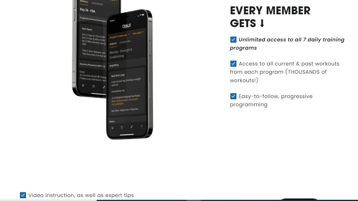
As you can see, this is a simple page with no clutter. What each member receives is clearly listed in bullet format, and it's all free for the first seven days, thanks to the 7-day free trial feature.
Whether you have access to a gym or prefer to work out at home, whether you want to slim down or bulk up, there is a program for you!
What appeals to me about this page is the use of eye-catching images to illustrate the seven different programs available. As you scroll down, you'll come across several testimonials from people who have achieved their health and fitness goals thanks to these programs.
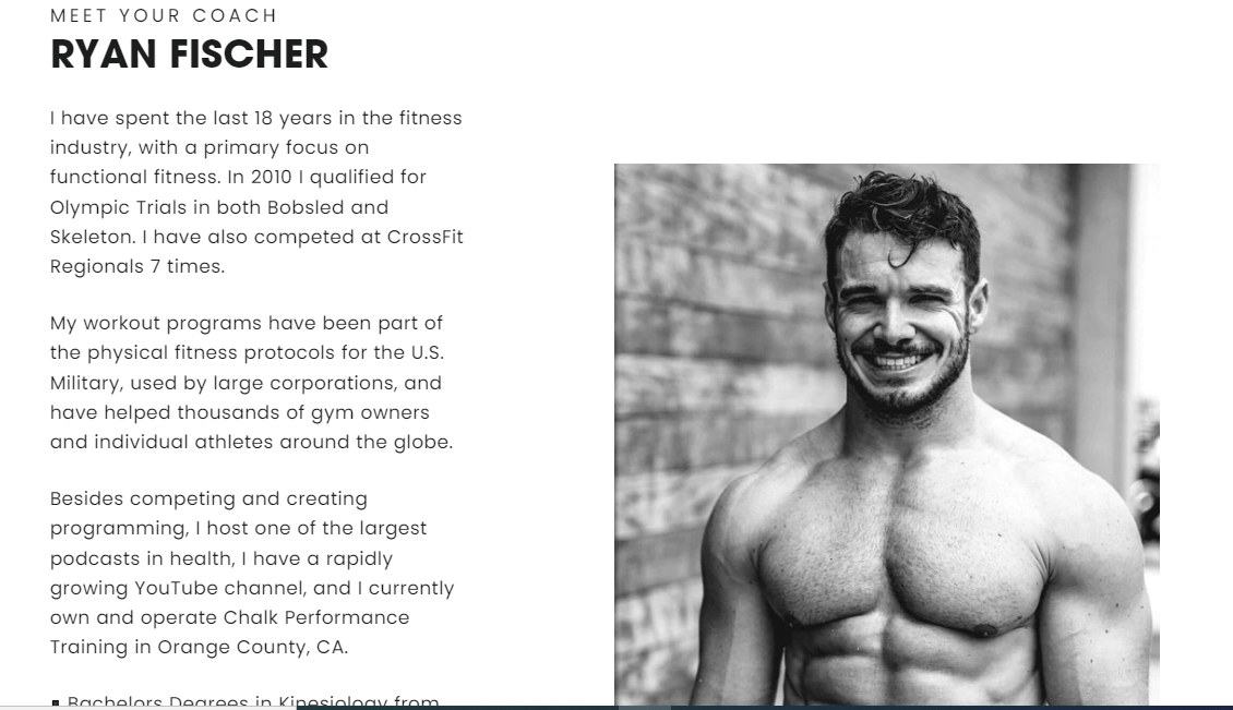
Another interesting element you'll come across is the inclusion of a "meet your coach" section with a catchy image followed by an impressive Portfolio. This, in particular, I believe will boost its credibility.
Finally, the page ends with an FAQs section where the coach addresses some basic questions the audience might have.
13. The Virtual Instructor
Created by: Matt Fussell
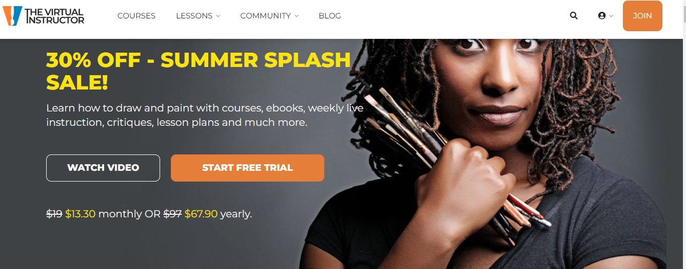
The Virtual Instructor is designed to teach you how to draw and paint by using different resources for every learning style. These resources include videos, e-books, live lessons, lesson plans, and more.
This sales page is very clean and professional, with cool graphics. It's a work of art, so to speak. And that's not surprising given that the page is for an Art course.
It has almost every element you could want in a sales page, from a big, bold headline to a concise and enticing offer, an introductory video, course roadmap, powerful testimonials, and so on. The design is also very consistent with the content of the course.
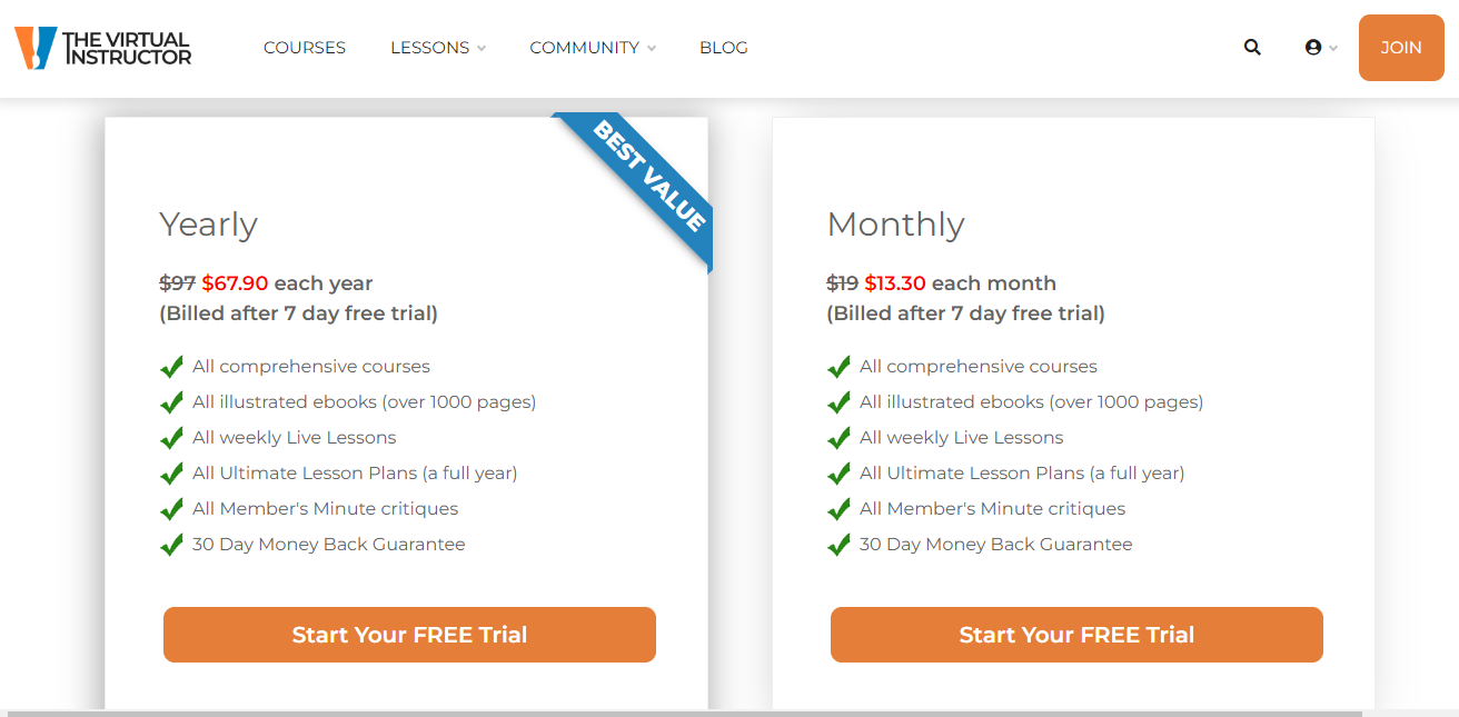
While it offers both monthly and yearly paid plans to give members different options, you can also take a look around with the seven-day free trial. Get instant access to all of the resources to see if the program is right for you. On top of that, it also offers a 30-day money-back guarantee. So, in essence, you have 37 days to try out the program risk-free.
14. Brain Academy
Created by: Gregory Cremans
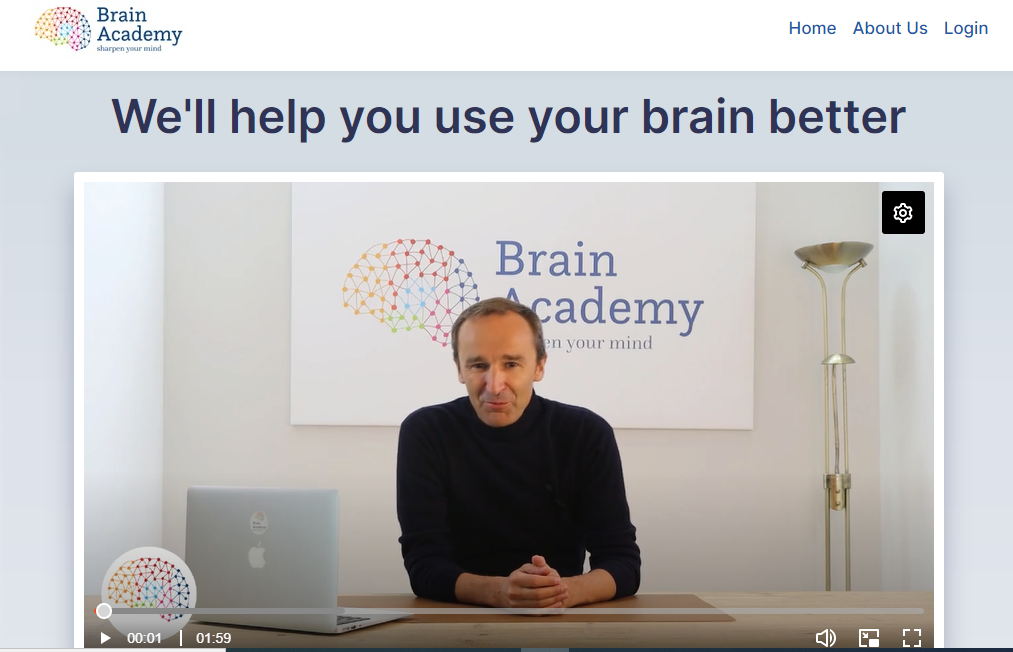
Brain Academy was founded by Gregory Cremans, who is also a TEDx speaker.
With over 400,000 students worldwide getting access to highly researched, unique and groundbreaking content, their aim is to make brain science accessible to everyone.
This page welcomes you with an introductory video and a free course to give you a taste of what the Academy has to offer.
Although there's not much going on here, when you click the "Get Premium Access to All Brain Academy Courses" button, you're taken to a completely different page.
This new page provides a better understanding of what to expect from the Academy. Greg explains in another video you'll immediately come across how the use of our brains defines everything in our lives. "Everything we do is related to our brain," he says, and "learning about it improves the quality of our lives dramatically." He then introduces the Brain Academy, which focuses on optimizing the brain for a better and more productive life.
The Academy Membership program provides access to over 300 videos, hundreds of articles, blogs, links, and other resources. It is divided into four steps, each with a distinct focus. All of these are available to members.
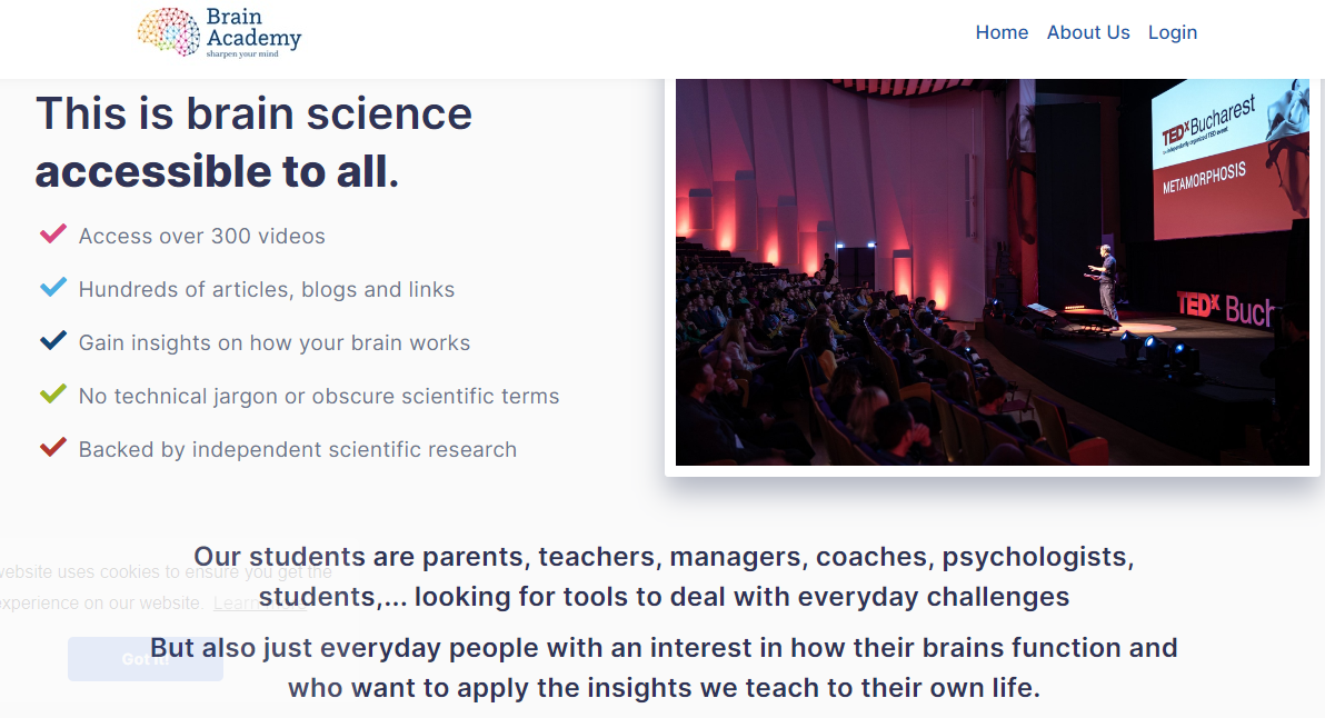
Greg uses a lot of student testimonials throughout the page, which I believe adds credibility to the program. In addition, including a completion certificate at the end of each course is an added bonus that would increase its acceptance.
15. Pierian Training
Created by: Jose Portilla
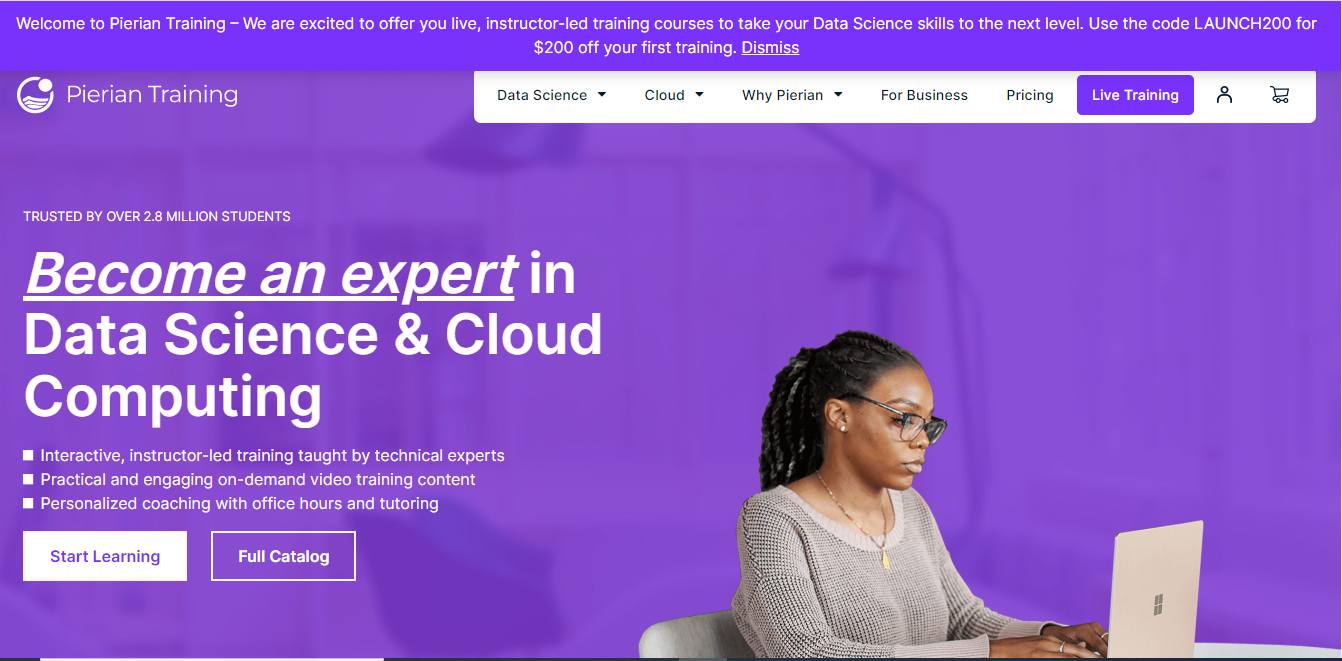
Pierian Training is a leading provider of high-quality technology training with a focus on data science and cloud computing. You could build a career or learn a skill in these niches with this training.
Data science and Cloud computing are two of the fastest-growing career paths, with numerous specializations that require advanced skills for many professions.
This page, like many others on this list, makes use of a simple design and layout to get the job done. On it, you'll notice that this isn't like most other online courses; it provides more flexibility for members. For instance, if you are unable to commit to an instructor-led training model, you can choose a personal training model. As stated on the page, these options provide numerous benefits in order to give students with the best learning experience possible.
The sales page also features some of the student reviews, giving interested potential students an idea of what to expect from the course. As you scroll further down, another thing you observe is cohort-based learning, where employers can empower their staff with the latest technology skills.
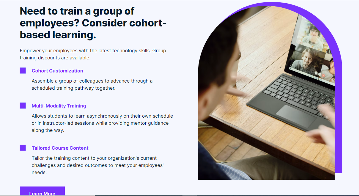
All of these and many more are what make this sales page an effective one.
Conclusion
A course sales page has one goal: to get people to buy your course. Therefore, anything that distracts the reader from that goal should be removed.
A high-converting sales page carries enormous value. It is essential to make your course work, and every successful course creator or marketer knows this all too well.
To make your sales page work, you need to position all the right elements in the best way possible:
- Call out your audience
- Demand their attention with a big, attention-grabbing, and promising headline
- Create irresistible intrigue
- Identify/Agitate the problem. After the headline and sub-headline, this is the most important copy on the page.
- Provide a solution.
- Show credentials
- Detail the benefits
- Social proof
- Make an irresistible offer. Make it concise and clear to understand.
- Add bonuses. This would help sweeten and add more value to the offer.
- Stack the value. Do this by itemizing each benefit and combining the value/price
- Reveal your Price
- Inject Scarcity
- Give a powerful guarantee
- Call to action. Don't ask them to take action. Tell them to take action.
- Warning
- Close with a reminder. ("PS.")
Once you understand how to properly incorporate these features into your sales page, it will convert better, and you will start making more course sales.
Take inspiration from the online course sales page examples above to create one that works flawlessly for your target audience.
And if you are looking for an affordable and super easy-to-use course platform to build your course sales page, then check out my platform OnlineCourseHost.com.
It has all the tools and features that you need to create a great-looking course sales page without needing any design or technical skills at all.
Here is a complete step-by-step tutorial on how to build a course sales page using this platform: How To Create The Perfect Online Course Sales Page.
But, more than a platform, we also want to give you all the information that you need to grow your online course business successfully.
That’s why we have created the Course Creator Academy where you can find everything you need to become a successful online course creator all in one place for free.
To get notified when new content is available here at the Academy, you can subscribe here to our weekly newsletter:
If you are looking to ask any questions on online course creation, you can reach me here on my Facebook group:
Join the Course Creator Academy Facebook Group
Ready to learn how to launch your first course on OnlineCourseHost.com? Here are the helpful guides for you to check out:
- Best Online Course Platforms (Ultimate Guide)
- How To Create An Online Course (In 15 Super-Practical Steps)
- How To Choose An Online Course Topic That Sells
- How To Record And Edit Your First Online Course
- Affordable Online Course Equipment - Complete Practical Guide
- How To Hire An Online Course Team
- The Ultimate Online Course Launch Checklist
- How To Create The Perfect Online Course Sales Page
- Create A Powerful Brand For Your Online Courses (In 5 Steps)
- How To Sell Online Courses? The Ultimate Guide
- How To Promote Your Online Course - Complete Guide
I hope you found this post helpful; let me know in the comments below what other topics you would like me to cover or any questions that you have?
Thanks for reading… and enjoy the course creation process! 😉
Vasco Cavalheiro
OnlineCourseHost.com Founder & Online Course Creator


 Start Here
 Course Creation Journey Step by Step
  Course Creation Software Reviews
 Online Course Marketing
 Course Creation Tips & Tricks
 Course Equipment
 Online Course Marketplaces
 Revenue Reports
 Best Practices
 Frequently Asked Questions
 Platform Reviews